Responsive Branding, Illustration & Font Design
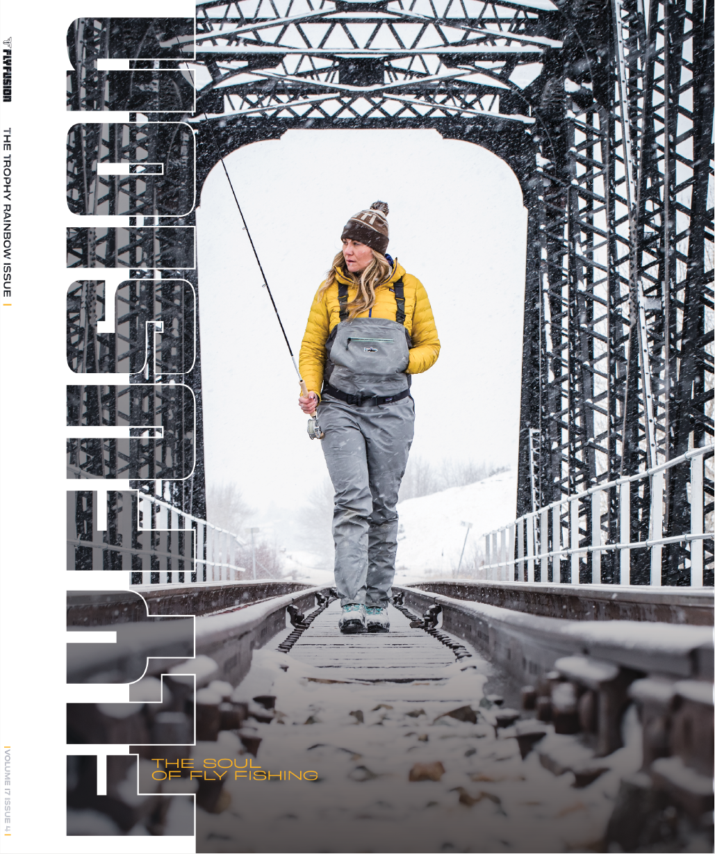
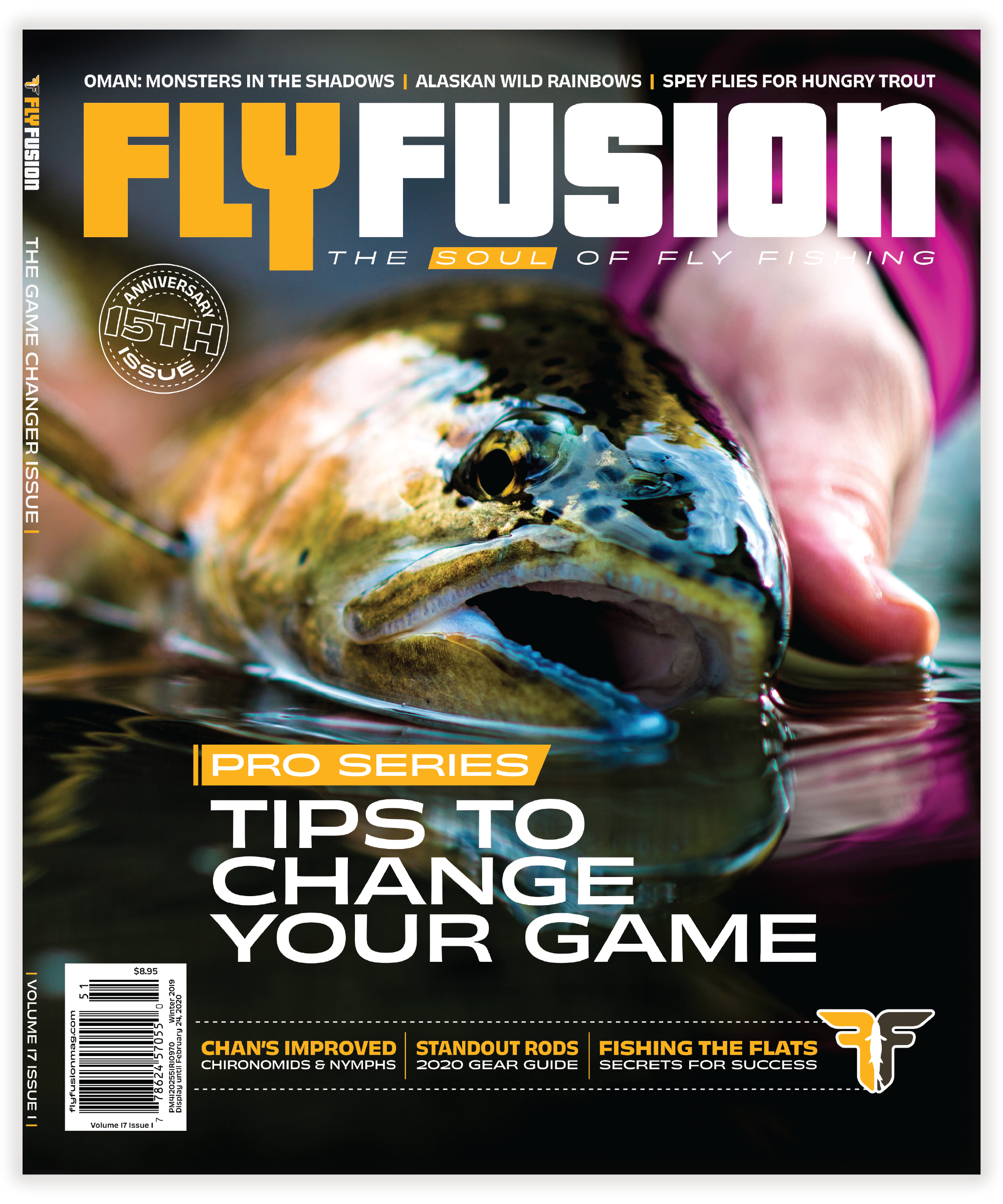
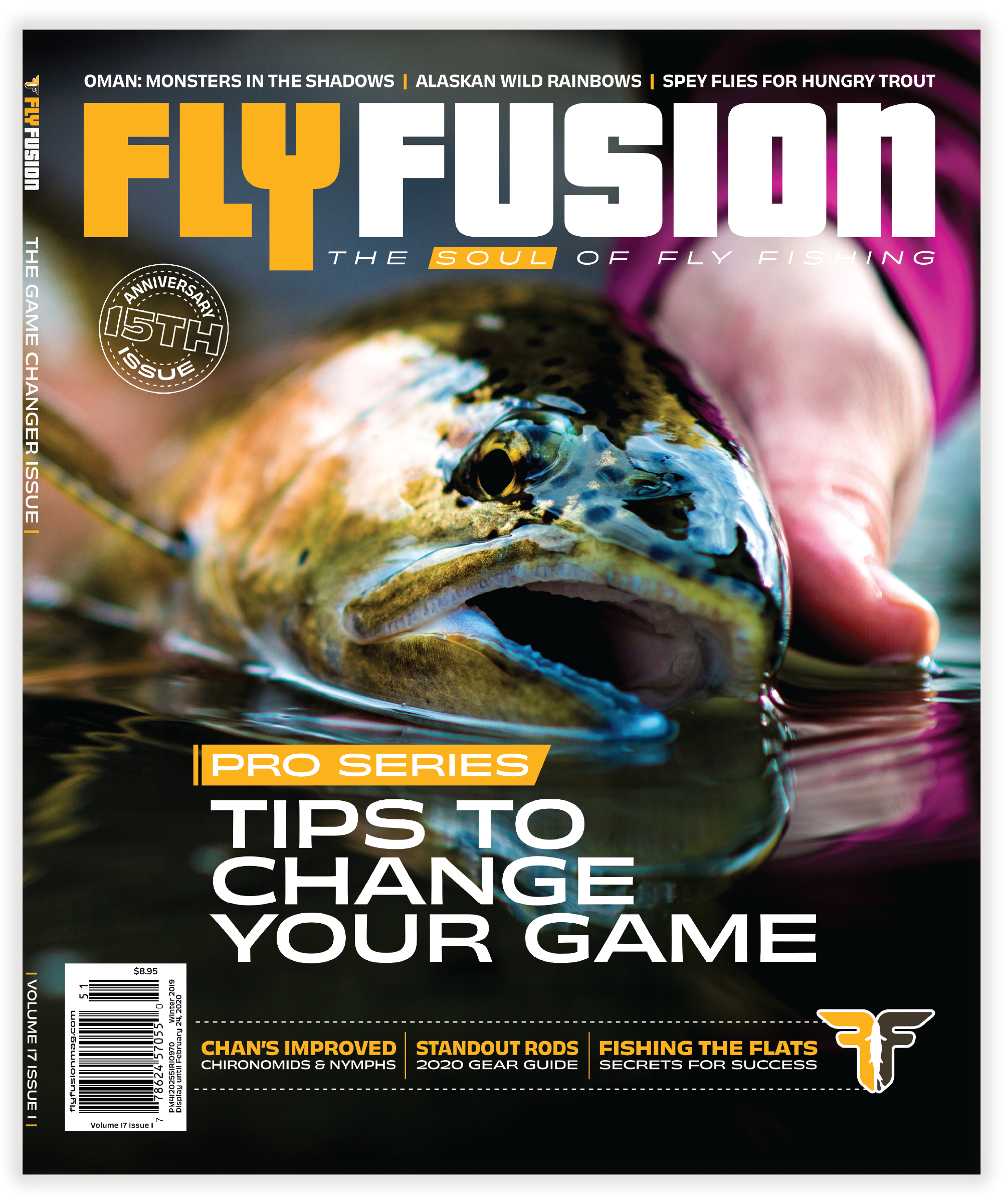
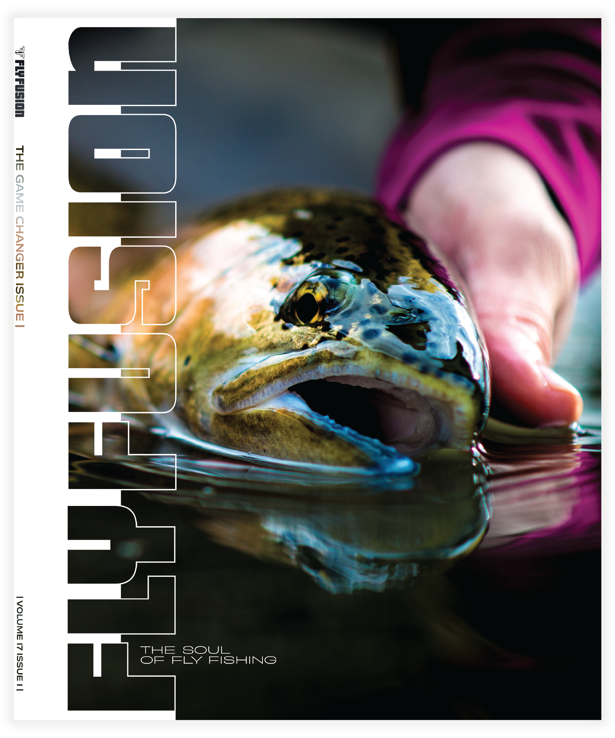
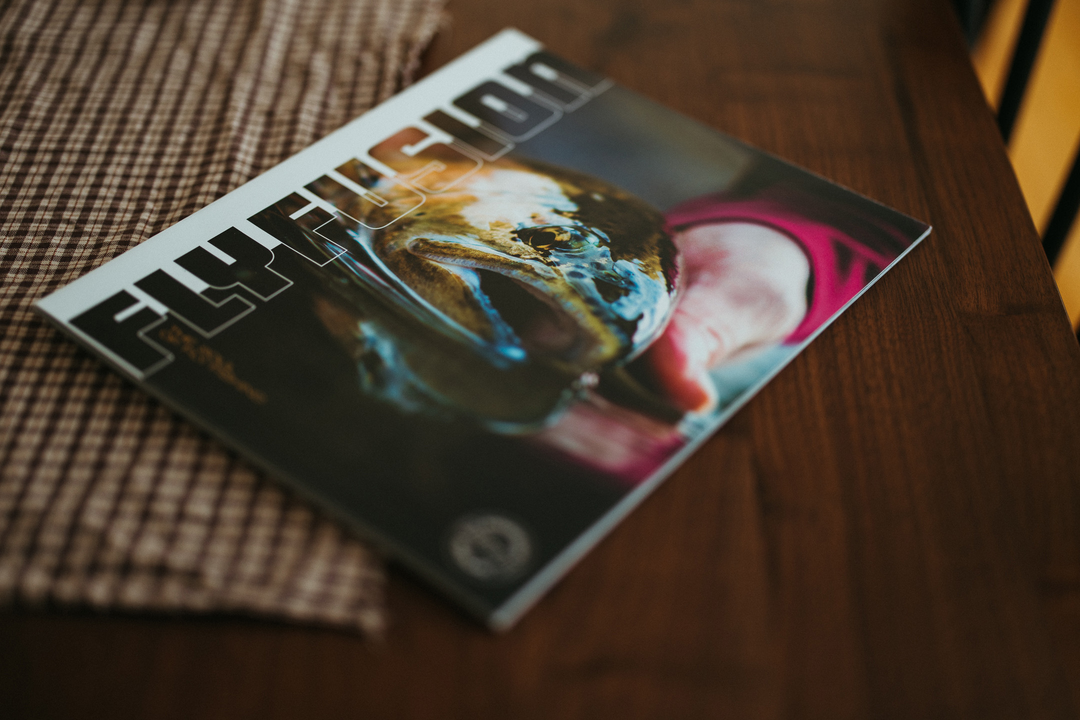
Fly Fusion has been one of the fly fishing industry’s leading publications for over a decade. Focusing on quality stories and showcasing beautiful photos, the magazine has a widespread and dedicated readership all over North America. The team came to me looking to create a new “Split-Cover” system for the magazine. One version of the cover would be optimized to be newsstand eye-grabbing, and the other would be shipped directly to subscribers and be designed to be a beautiful showpiece on every angler’s coffee table. I created a system that allows for more information than the previous cover system while also letting the photo shine and take the spotlight more engagingly. The result is a magazine where the brand and the photos are embedded together, instead of the headlines and logos feeling like a separate entity from the photos. A true and worthy representation of a magazine that strives to be “The Soul of Fly Fishing”.
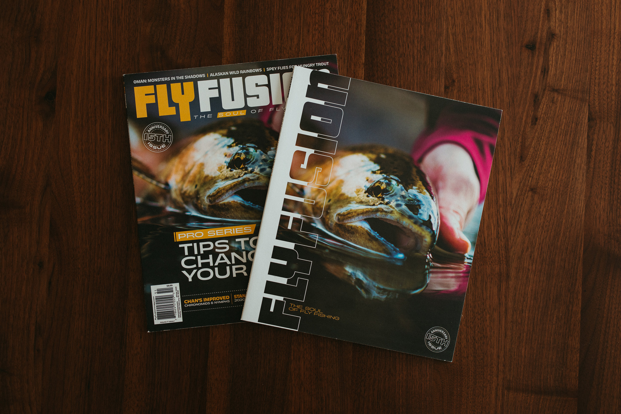
SLIDE TO SEE THE TRANSFORMATION!
METHOD TO THE MADNESS
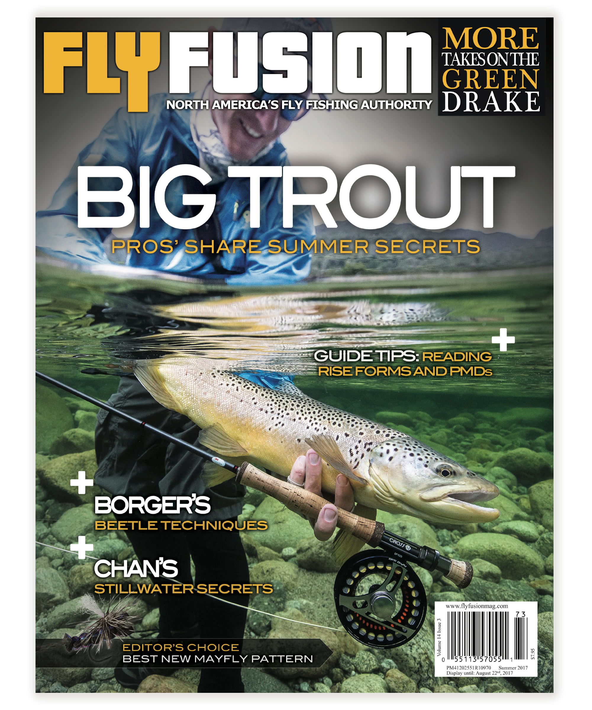
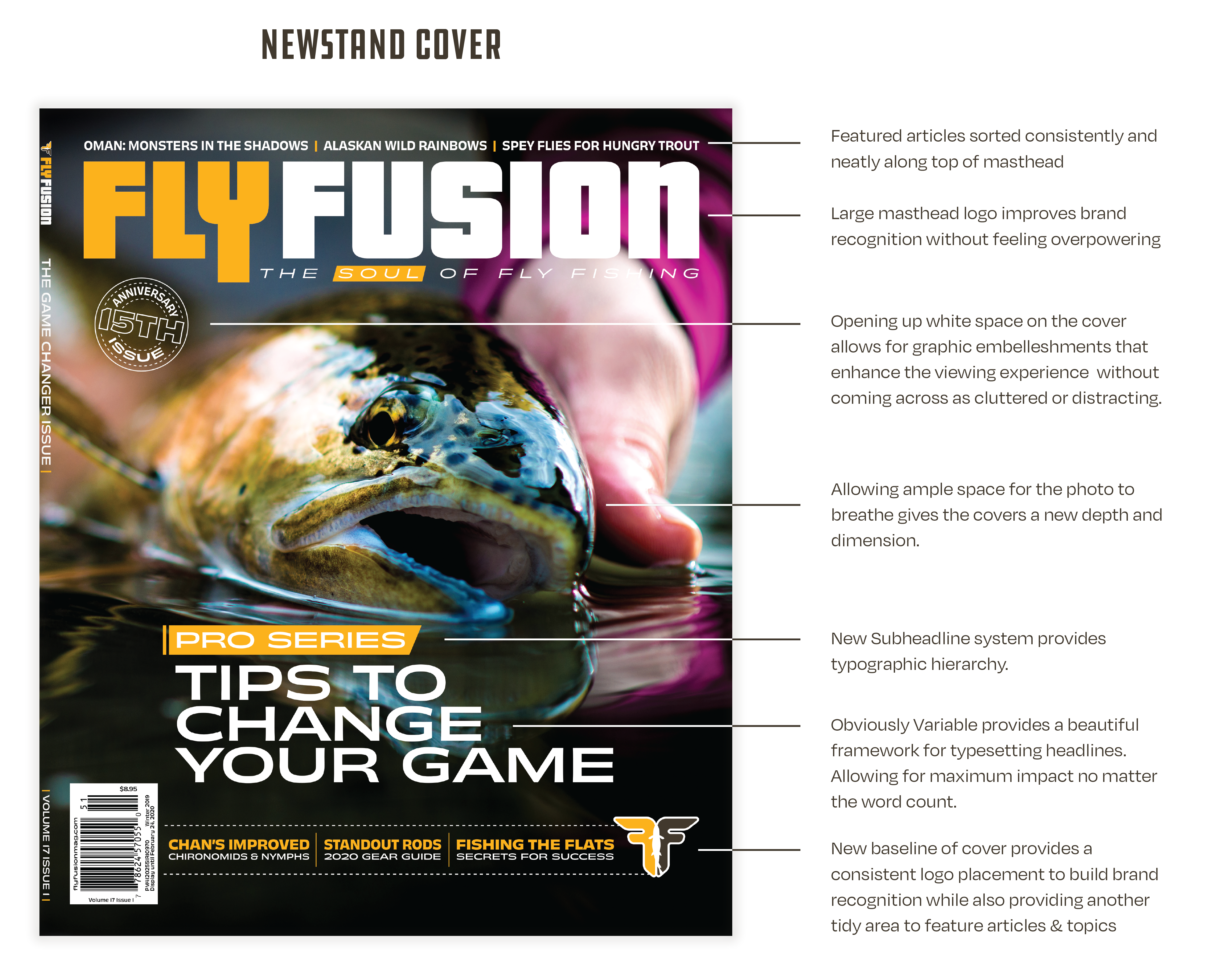
While the previous cover system (shown above) had a distinct look, it lacked consistency. Because of its dependency on larger subheadlines placed around the photo, each cover would look different, with information placed all over the cover depending on the featured photo. While it conveyed the information clearly, it didn’t leave much room for the photo to breathe. As I designed the new system, I focused on building a way to convey information consistently from cover to cover while showcasing the beautiful photography that Fly Fusion is known for.
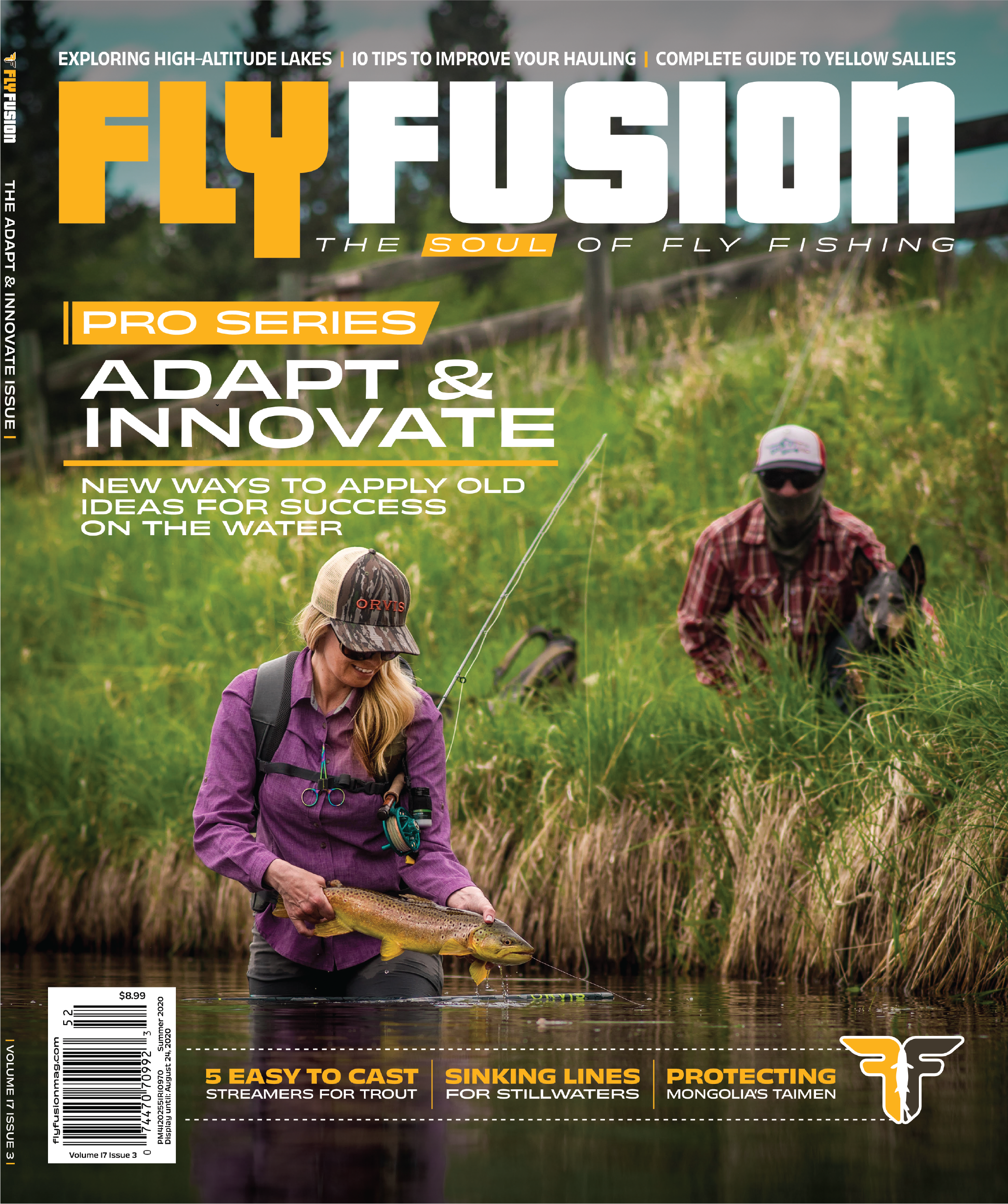
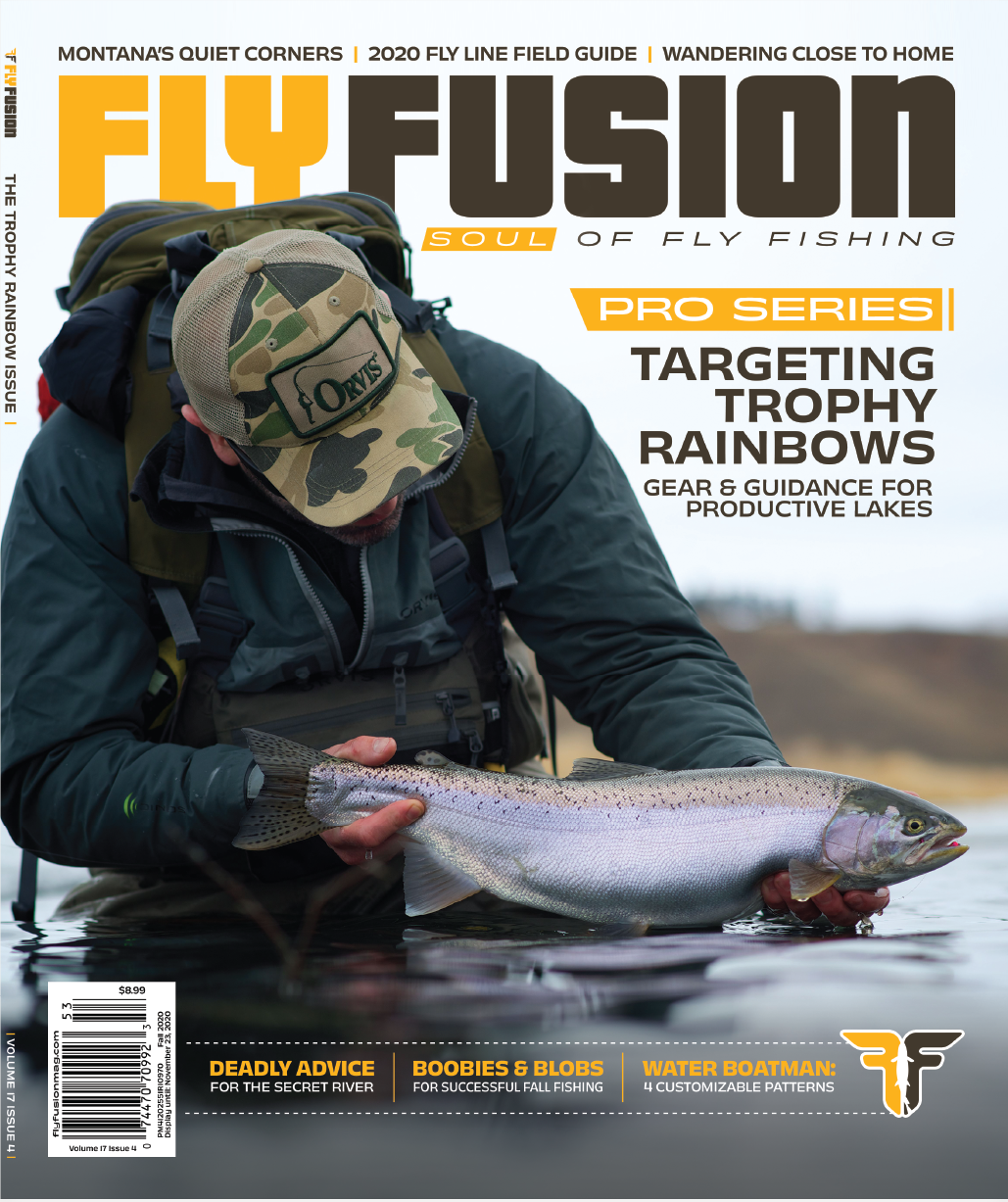
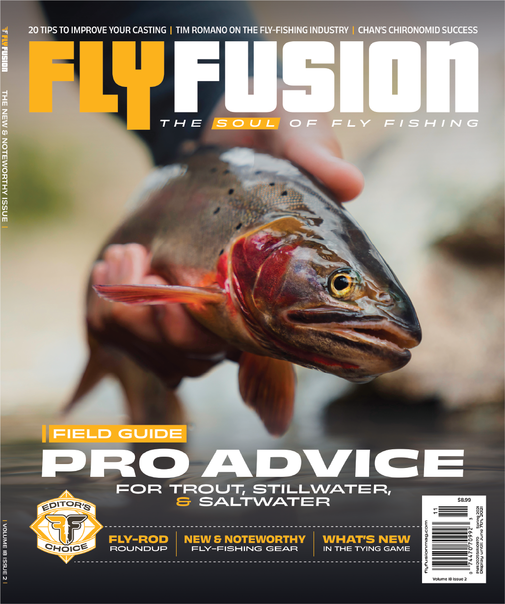
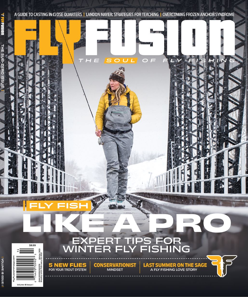
The newsstand cover consists of one main “Sell Line” that can move around the cover depending on the photography. Then, all of the other articles are featured in two consistent areas along the top and bottom of the cover. There is enough consistency to allow the photo to shine but enough flexibility that the covers don’t feel stale.
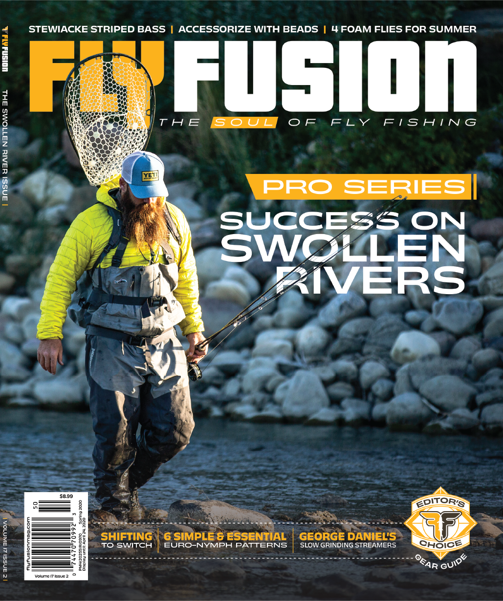
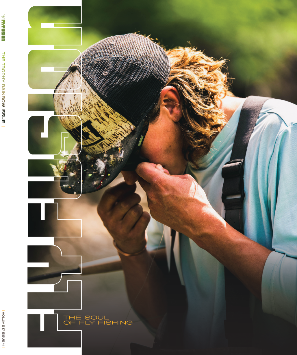
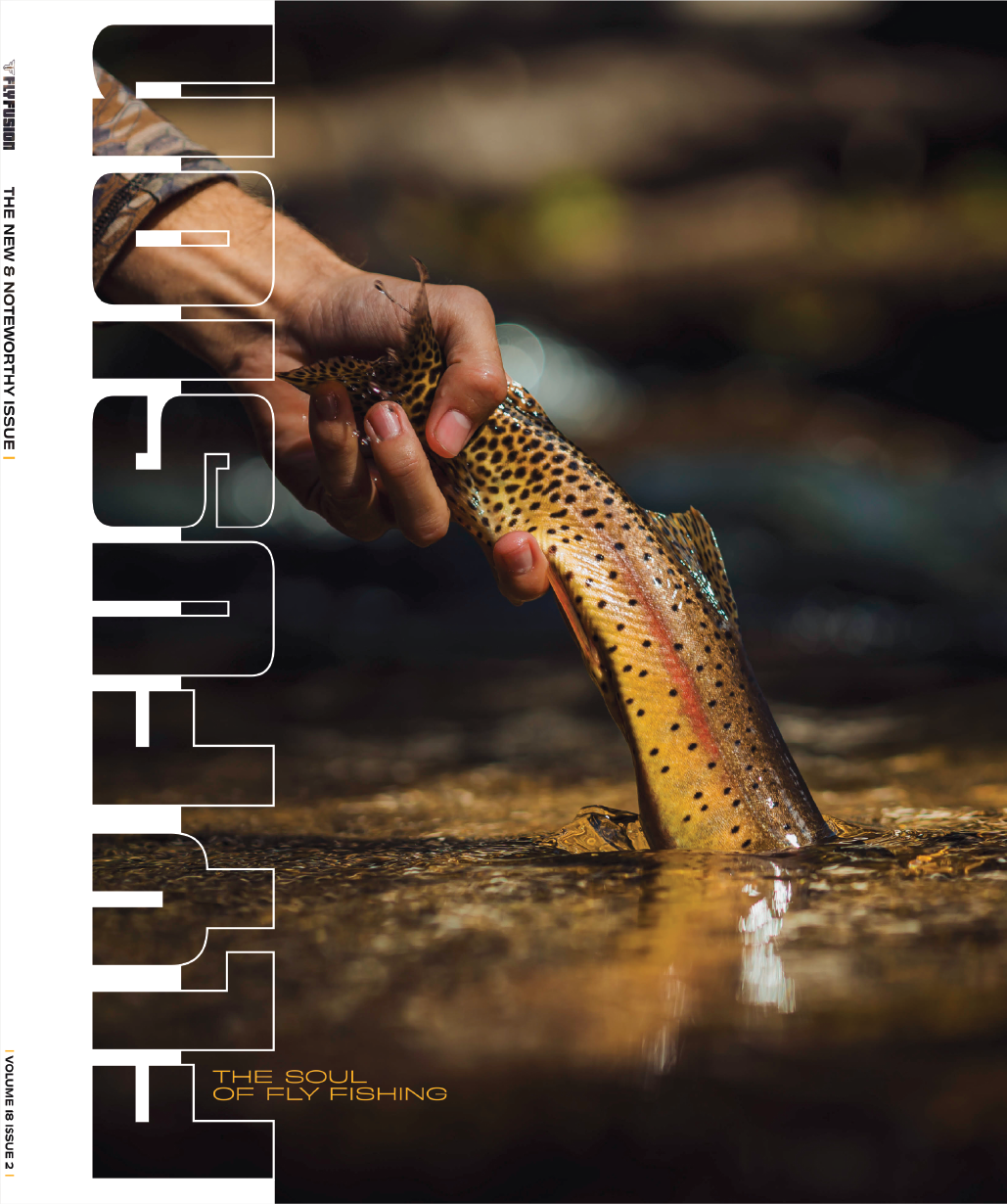
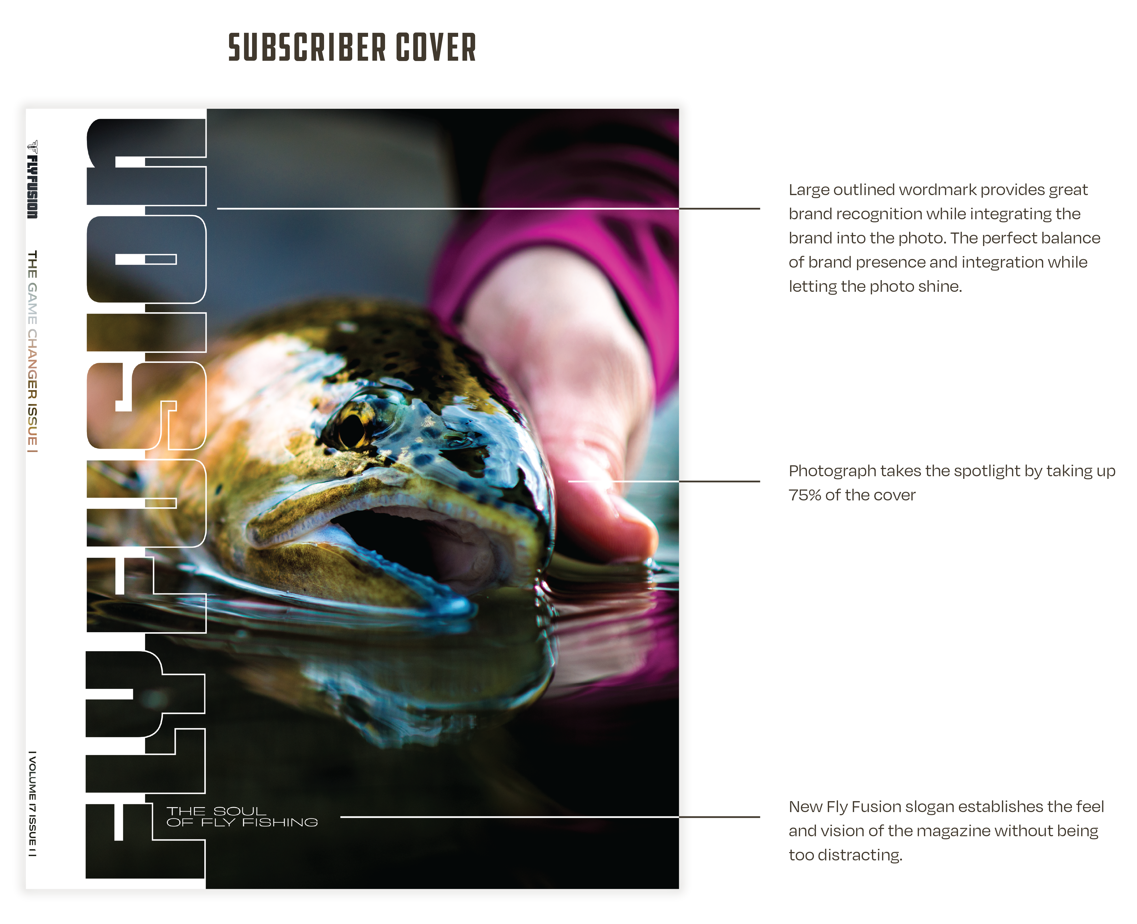
The subscriber cover uses an extra-large version of the Fly Fusion wordmark displaying the logo as a part of the photo. This creates a beautiful photo experience for the dedicated subscribers’ coffee tables and a great brand showcase.
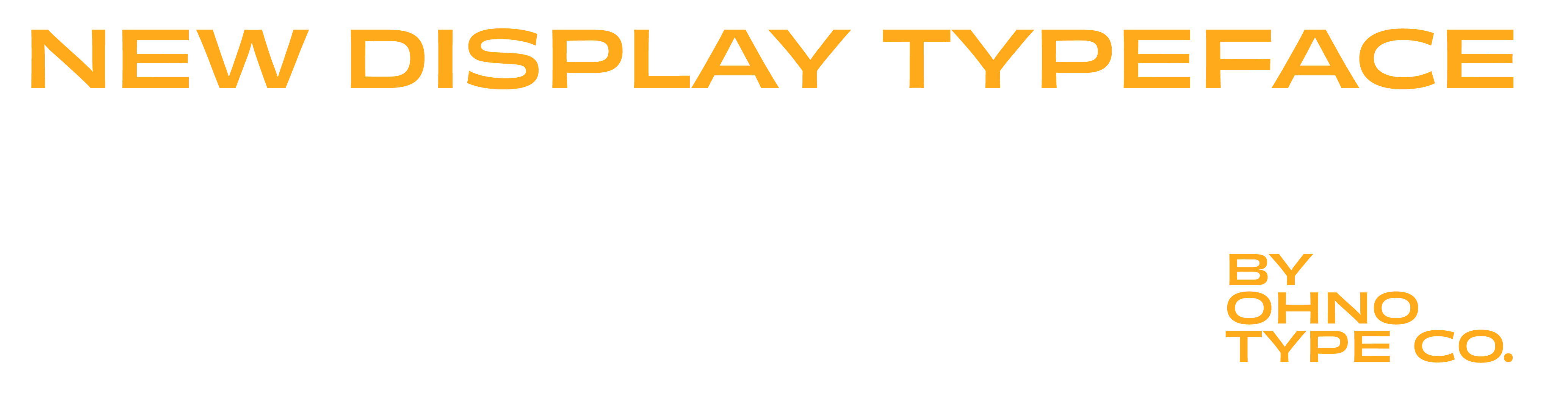
One of the most noticeable changes to the cover system is using a new headline & display typeface. While Obviously by OHNO Type Co. may resemble similar traits of the previously used typography on the cover, it’s a different beast altogether. Obviously’s variable traits allow its width and weight to fluctuate without increasing the letter height of your headline. This makes for a system that can occupy space easily, efficiently, and effectively. This flexibility is vital in keeping the cover looking consistent. No matter the content on the cover, the sizing of headlines and sub-headings can remain consistent, keeping things clean and classy.


A WHOPPING SUCCESS
As we pass the 2-year mark for the new cover design being implemented, Fly Fusion has never been more popular or seen such high subscription numbers. The new system beautifully showcases all of the things anglers love about their sport while providing valuable information at their fingertips. The gallery below showcases how versatile the system has been and continues to be, displaying the last 2 years of covers.