Joe Ruffler originally came to me in 2017 looking for a fresh coat of paint for his Twitch channel, then called Ruffles TV. Since then, Joe’s content has shifted in focus from video game content to Anime and Manga reactions, watch-a-longs and reviews on YouTube & Twitch. With that came a name change and the need for a visual style to accompany his new content direction. Ruffles TV became Ruffsenpai. This rebrand focused on keeping all of the successful attributes from Ruffles TV while bringing an authentic Anime aesthetic that would integrate better with his content.

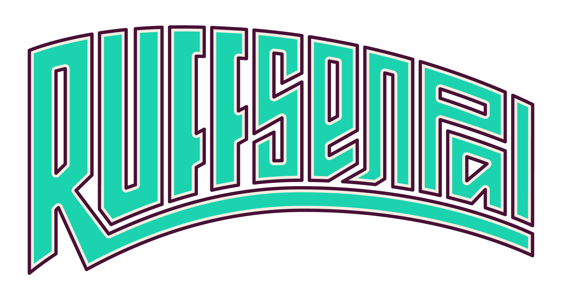
WARPED TYPE
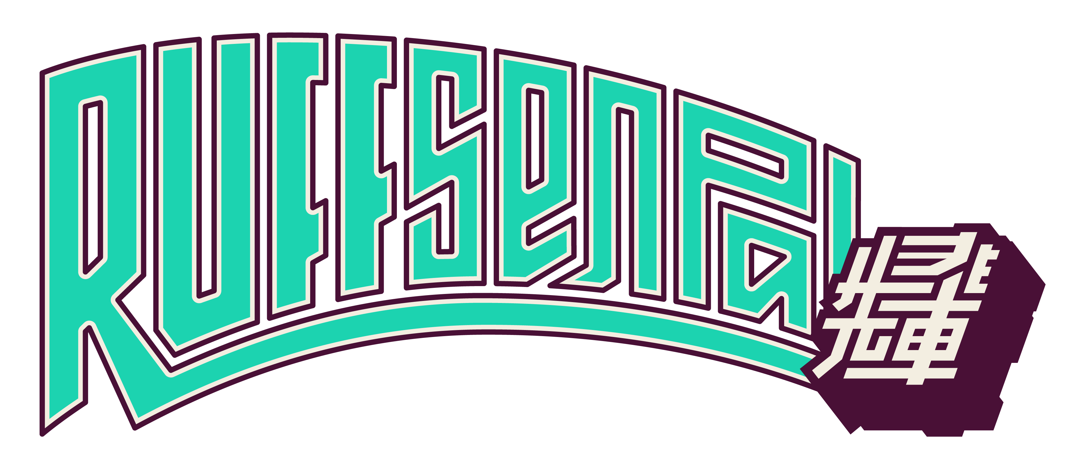
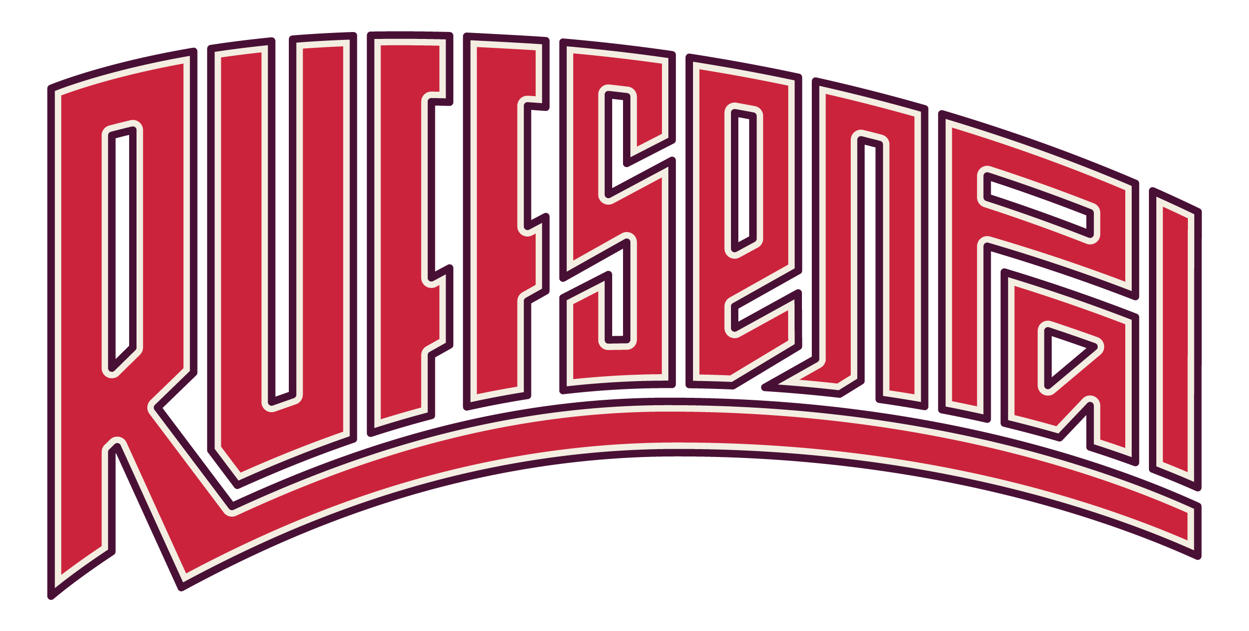
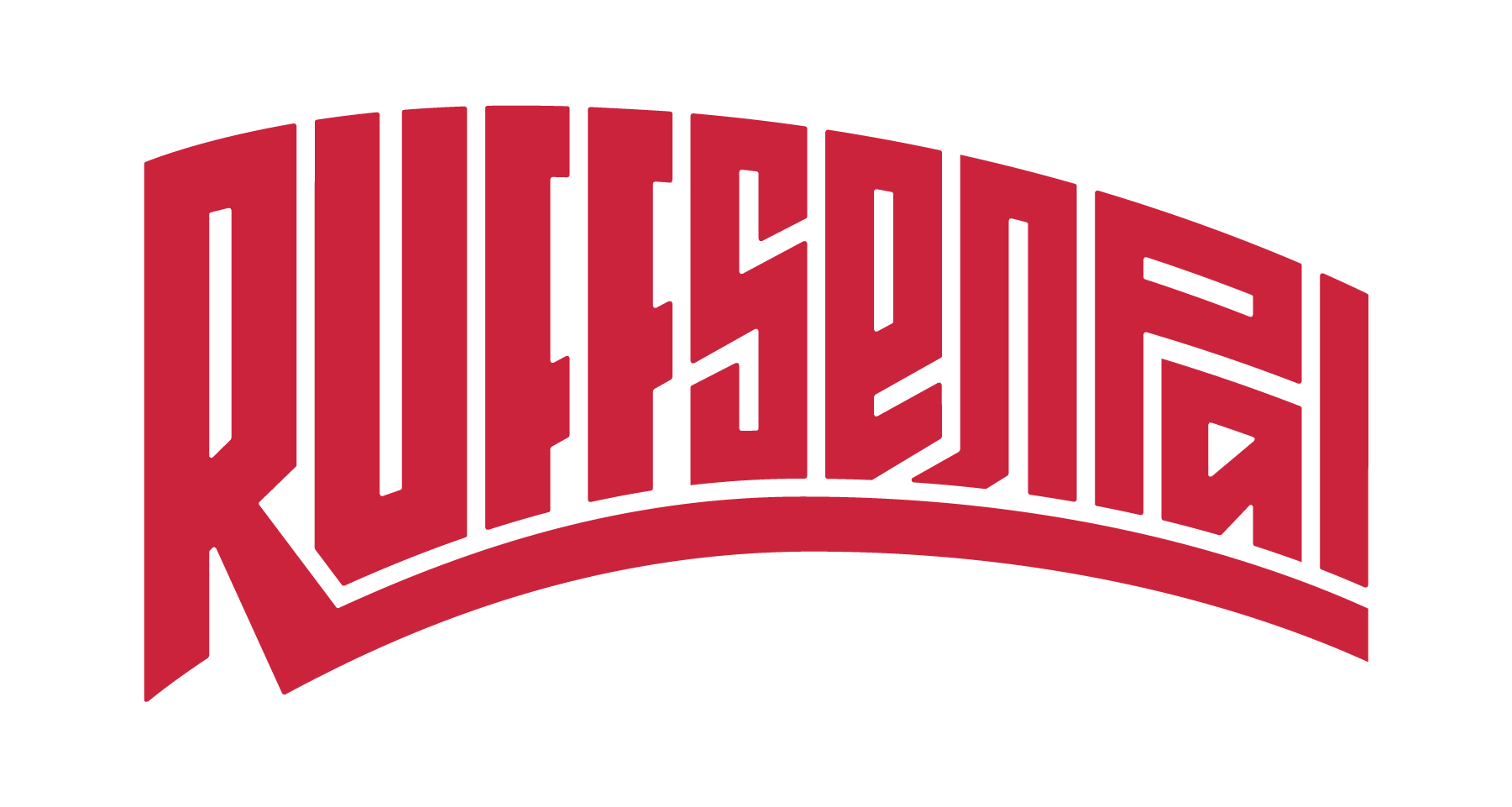
Anime & Manga logos often use iconic wordmarks to help them stand out from each other. The Anime signature style is defined by warped type, interesting shapes, and bold weights. I wanted to create a wordmark that followed these styling cues while still referencing the geometric approach from his original RufflesTV branding. So I created a monogram/icon inspired by Joe’s previous RTV icon, but with an anime sense of motion and bold weight like the new wordmark. They fit seamlessly together with familiarity to people who followed Joe’s content earlier in his career.


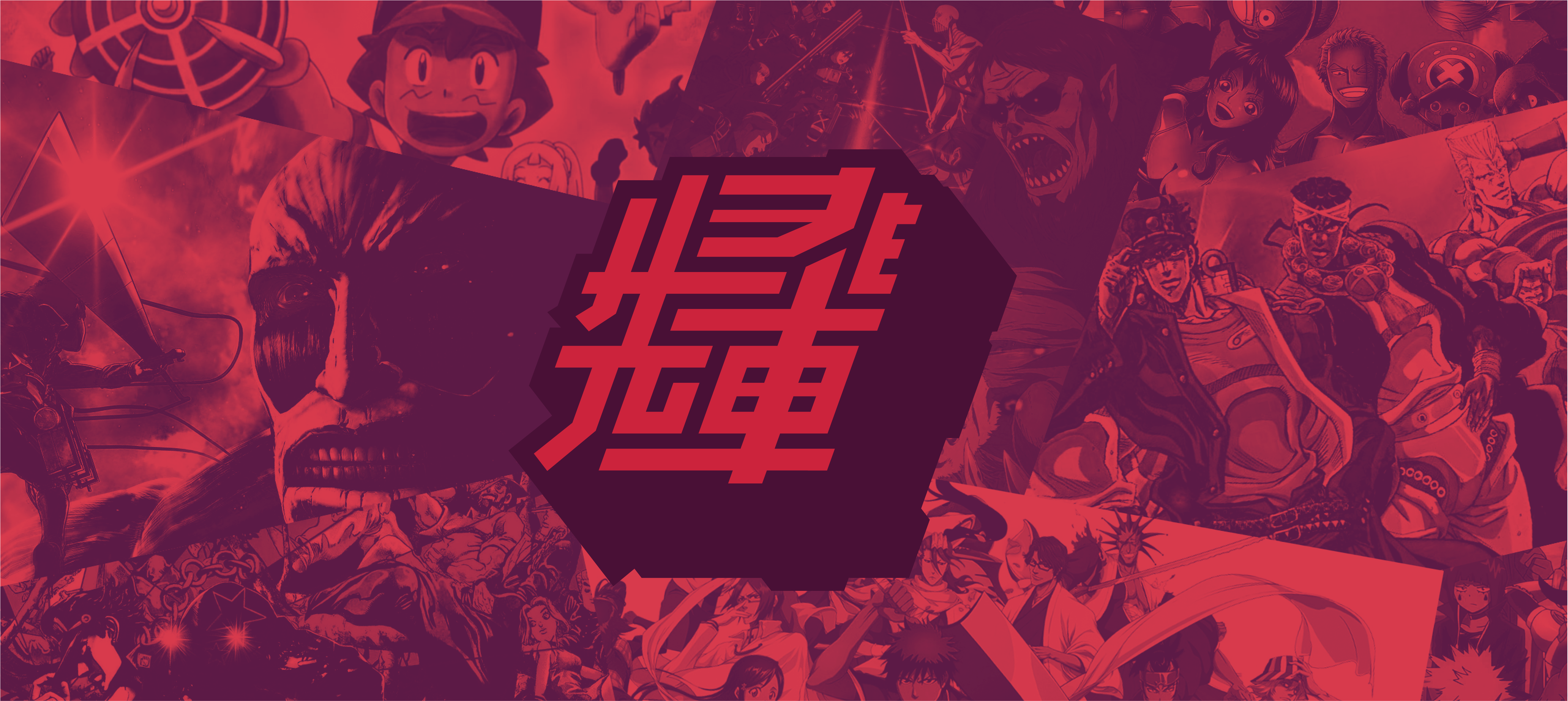
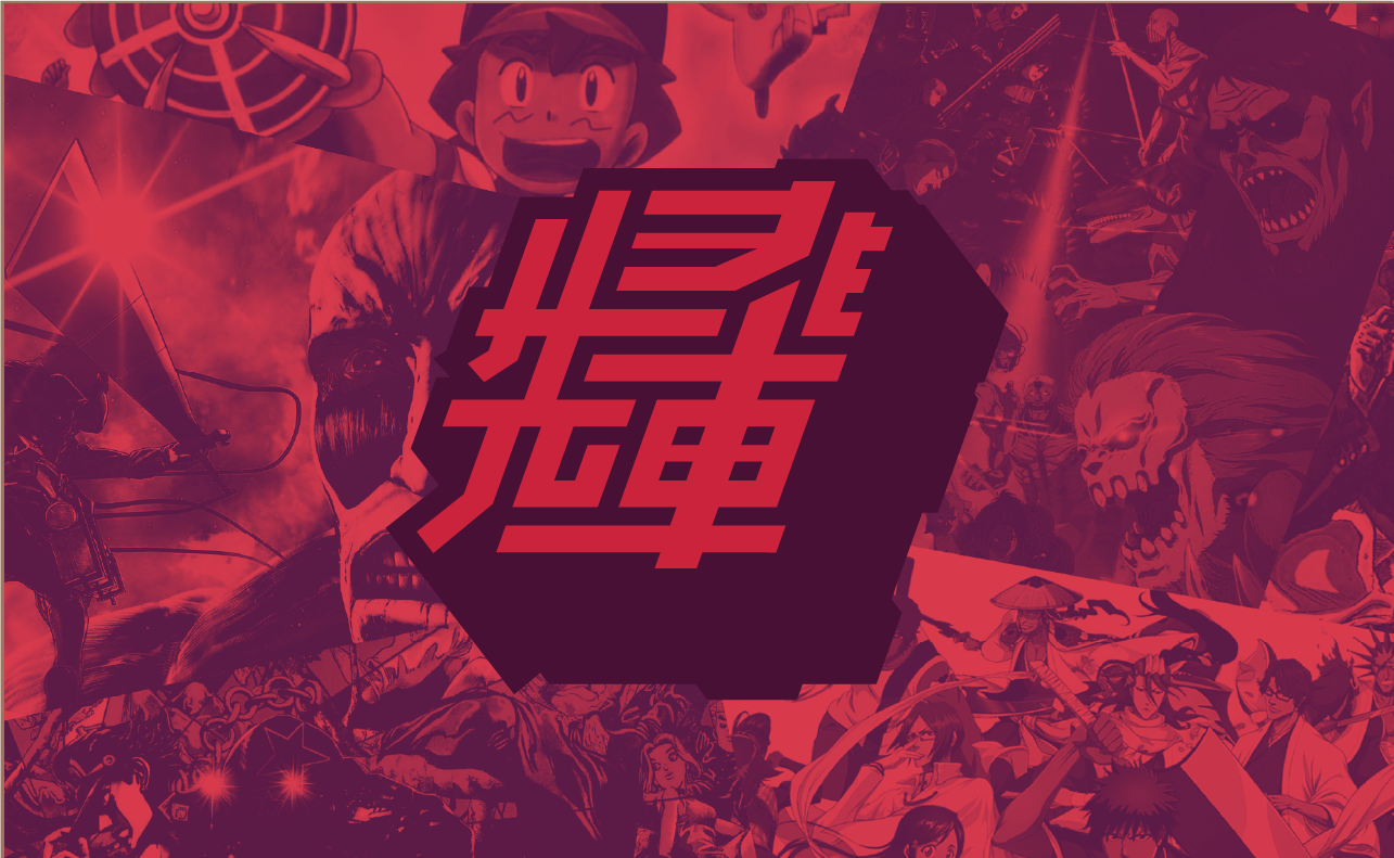
A CUSTOM KANJI
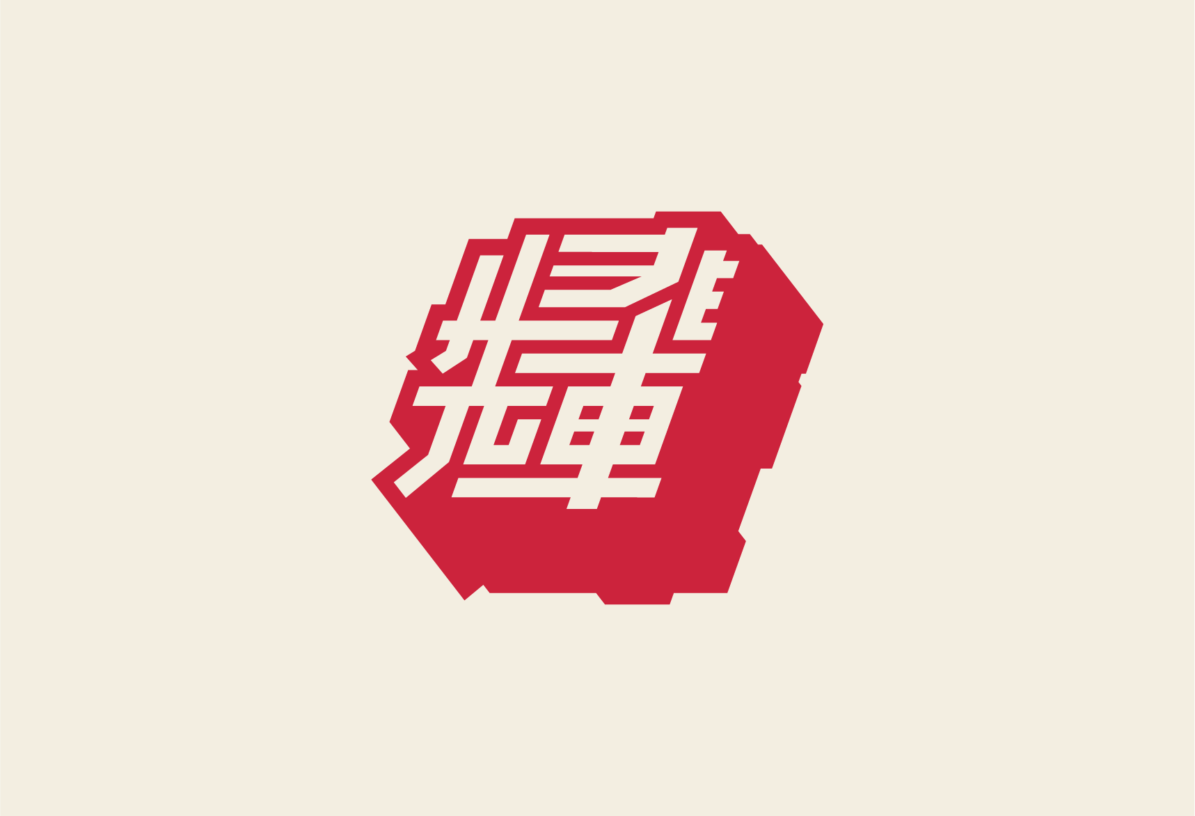
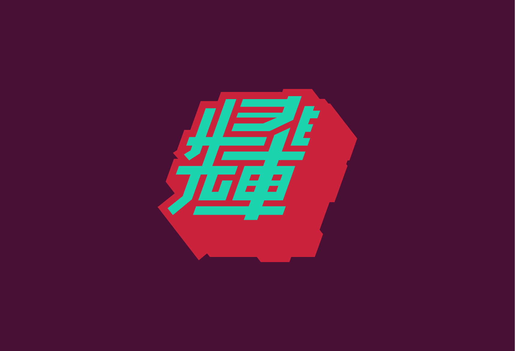
Kanji are the adopted logographic Chinese characters used in the Japanese writing system. They are commonly used in Anime logos and title cards. By taking the two Japanese Kanji characters for “Senpai” and combining them into one custom Kanji character, it creates a unique and identifiable icon for RuffSenpai.


COMING TOGETHER
Combining the stylized wordmark and the custom Kanji creates a super dynamic and engaging logo experience for RuffSenpai’s brand. It fits inside Joe’s anime sphere without being completely locked down to a specific Anime style. A perfect centrepiece to build a community on. Mission Accomplished.
