Steeples Veterinary provides industry-leading pet care to the entire East Kootenay region of British Columbia, and they’ve been doing it since. With a focus on genuine trusting relationships and removing the stress and worry surrounding veterinary services and pet medical care – Steeples loves the animals they treat like a member of their furry family.
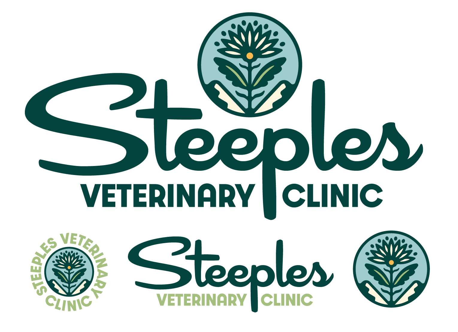
Steeples owner Ruth came to us looking for a brand refresh to accompany their newly renovated state-of-the-art clinic while giving things a fresh and relevant look for the next decade of business. With a mid-century twist, and a heartwarming, cozy feel, this brand is a breath of fresh air for the veterinary industry.

SOMETHING DIFFERENT
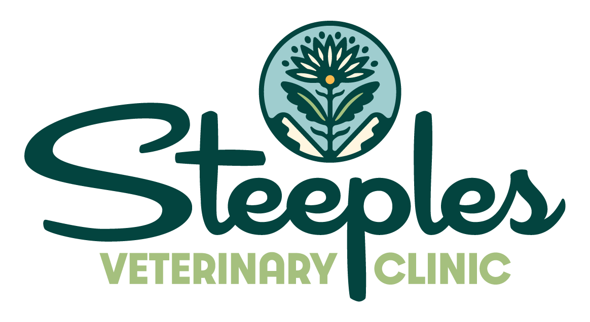
Ruth wanted to avoid all of the cliches of typical “vet” logos and, in turn, capture a genuine feeling of care, healing and heart. Early on in the project, Ruth showed us a sample of some wallpaper soon to be hung in their exam rooms. It featured a mid-century geometric dandelion pattern. She explained that dandelions are a universal symbol of healing and care. Lightbulb Moment! Cue a mid-century dandelion in the mountains (as an homage to the mountain range the clinic is named after), and you have a perfect symbol to focus the Steeples’ vision on.
These are the moments of projects we love most, the little bits of conversation with clients that spark unique ideas – that’s what brand story is; Experiencing the vision of the business through the people that created it.


THE COMPLETE MID-MOD PACKAGE
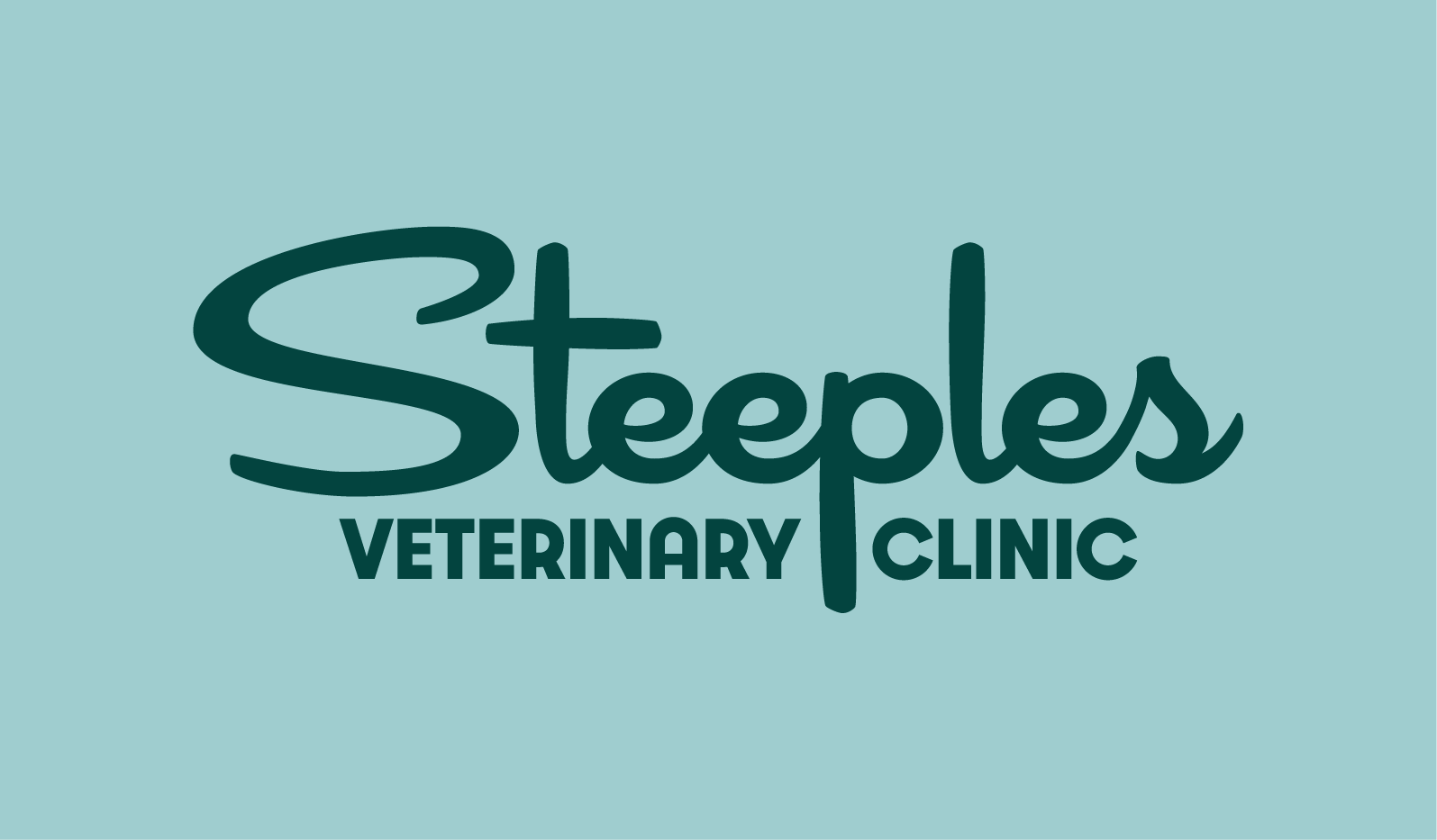
We designed a set of contextual alternates to give the logomarks as much flexibility as possible, complete with customized mid-century typography and a round typography-based badge. A comprehensive brand solution that feels as warm and fuzzy as a good snuggle with a puppy.
