Grist Cycles
BIKES ARE CHILL.
A small, locally-owned bike shop focused on the enjoyment of the ride, not the skill of the rider.
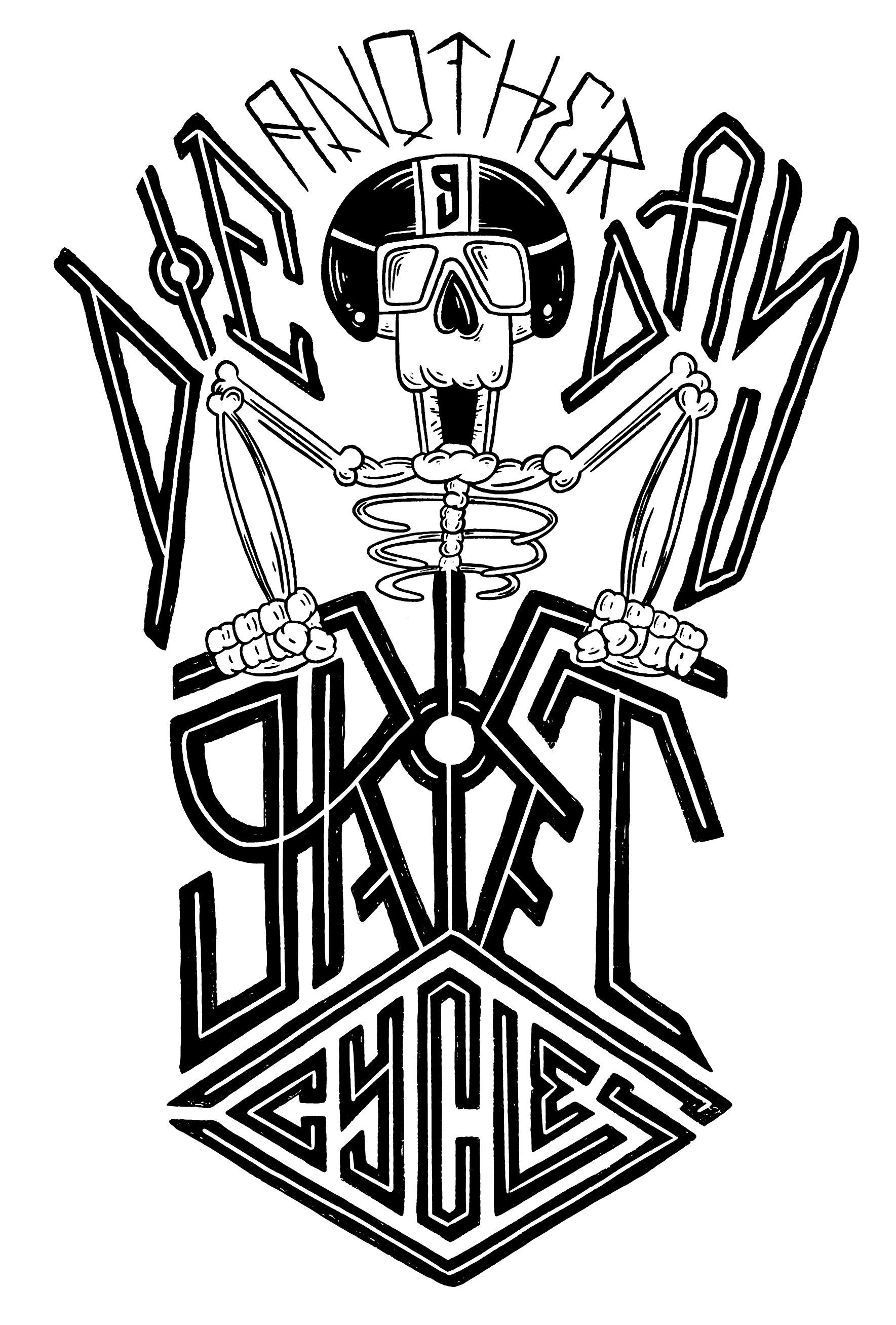
Casey from Grist and I sat down for coffee, looking for a way to bring a fresh new look to the bike shop while being unique and infusing more personality into the shop. Casey has a mild obsession with old Norse legends/fables, all rooted in an extinct runic language called “Elder Futhark.” It’s odd, hard to read, and there’s really not much info on it. We thought it had a ton of personality and really suited the “wild, free-spirited” personality Casey wanted to instill into the brand, so I ran with it.
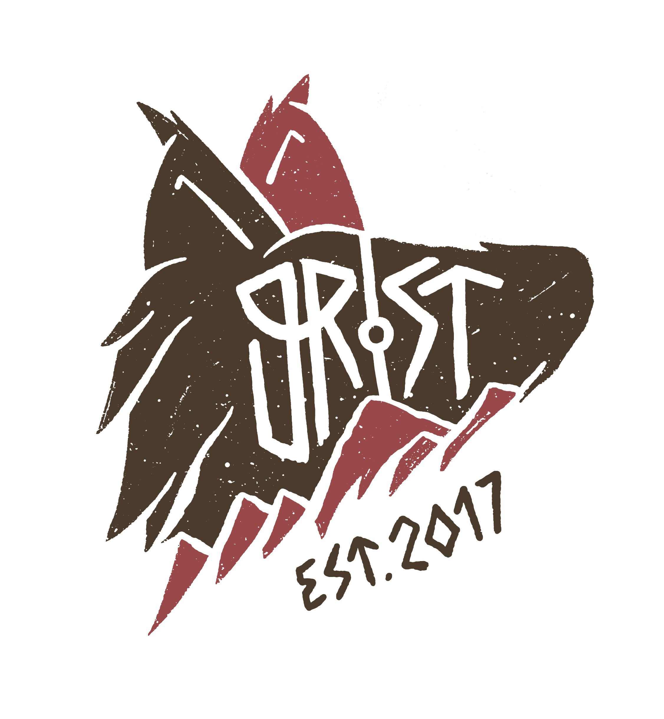
THE NUMBSKULL
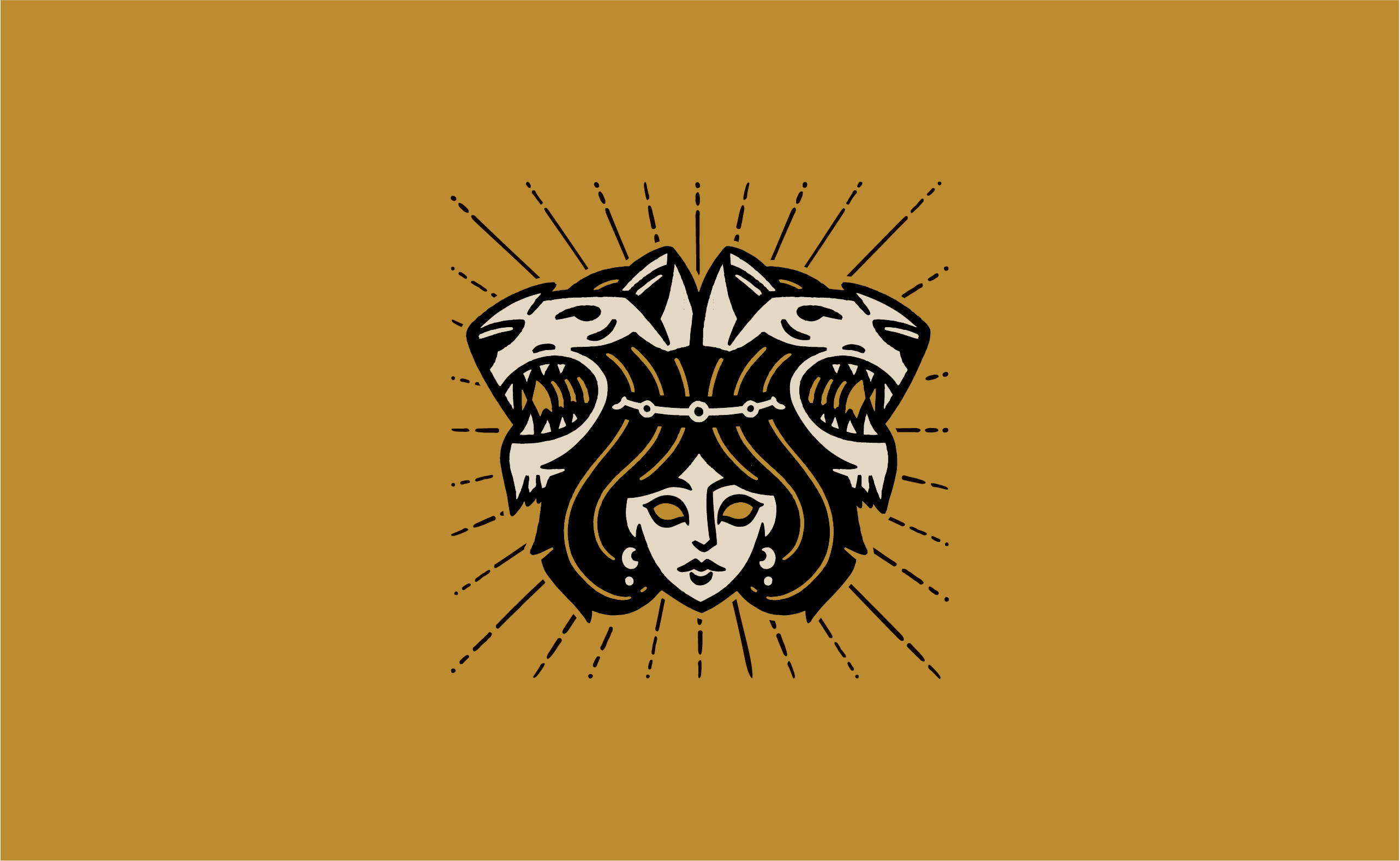
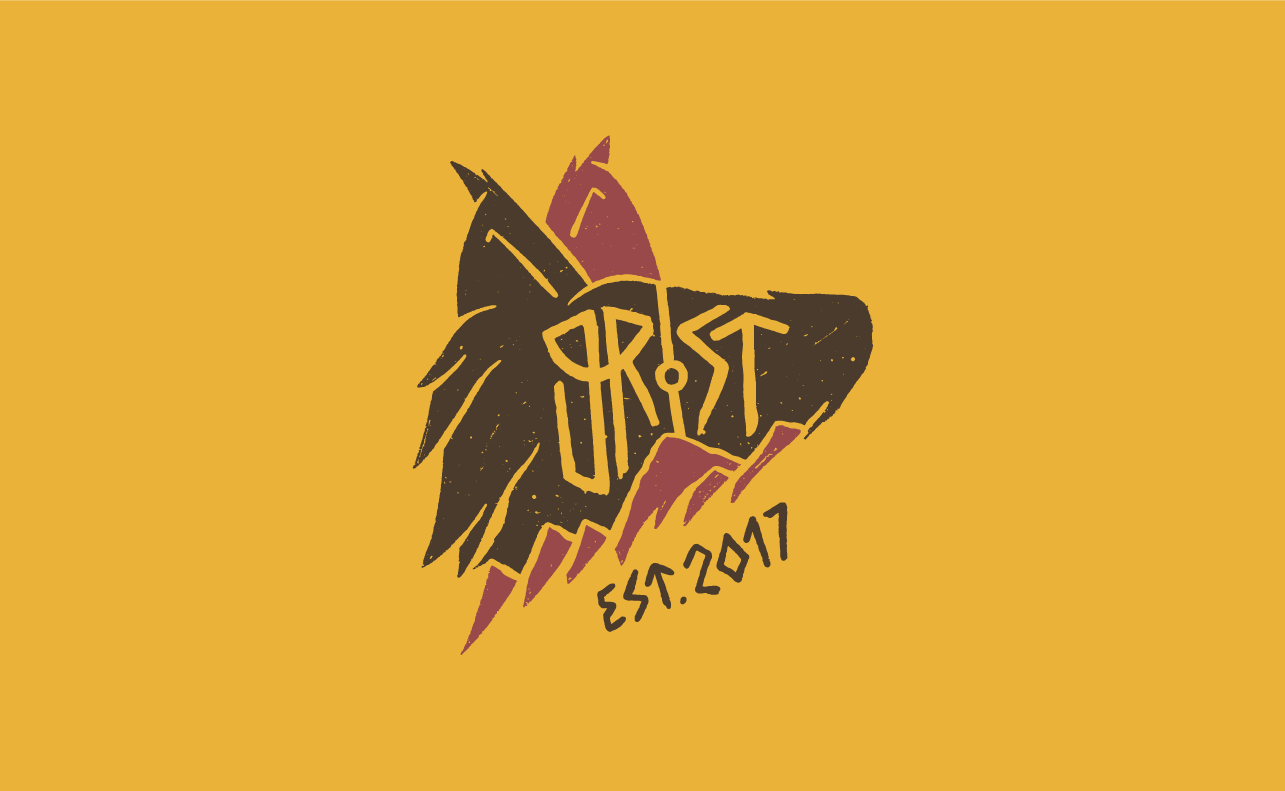
Casey’s fellow cyclists know that there’s no place he’d rather be than venturing outside on his bike. I wanted to capture that free-spirit, wild, adventure-chasing attitude. Thus, the main mark, “the numbskull,” was born. Neither human nor animal, this was a spirit afraid of nothing and ready for any adventure.
ELDER TONGUE
Inspired by Elder Futhark, the logotypes’ letters were drawn with historical accuracy while remaining legible in English. I wanted to make sure that the mark had some tie-in to the bike shop, so the tops of the letters are designed to resemble handlebars. This took a lot of experimenting with different letterforms and referencing many weird, old rune charts for Futhark.
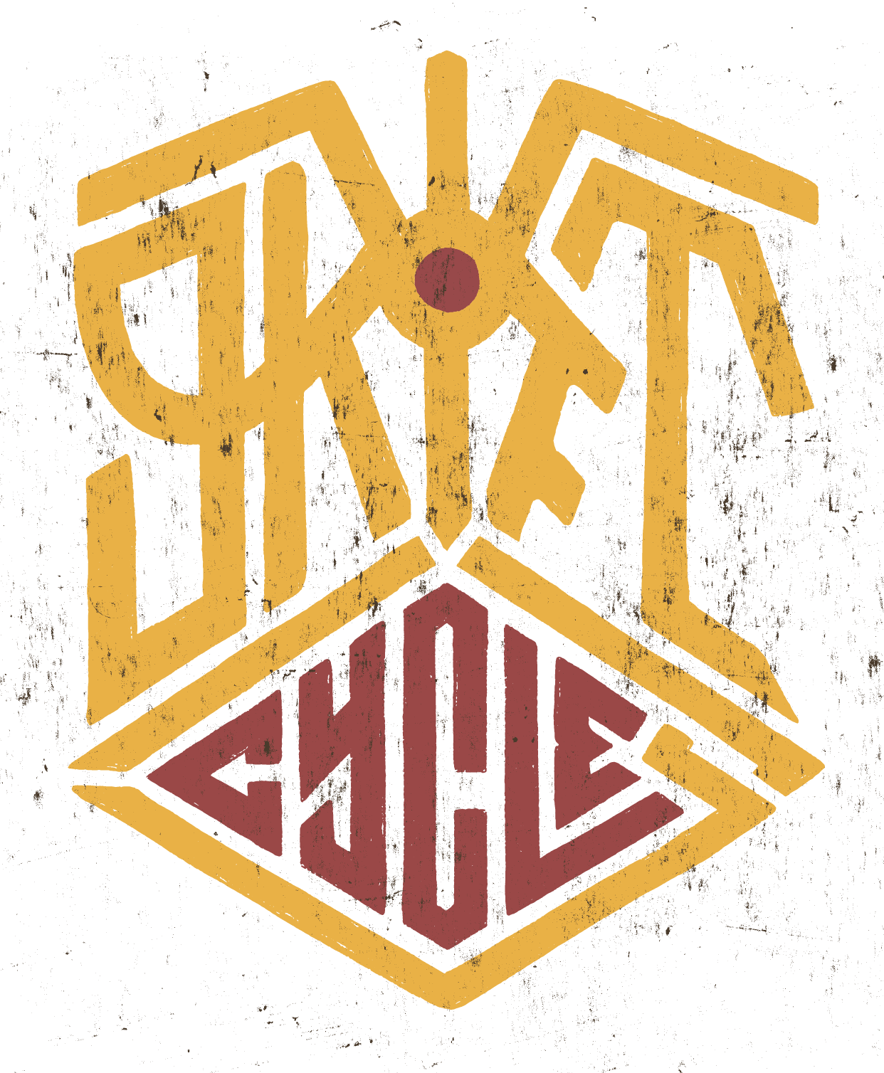
SLICE IT UP
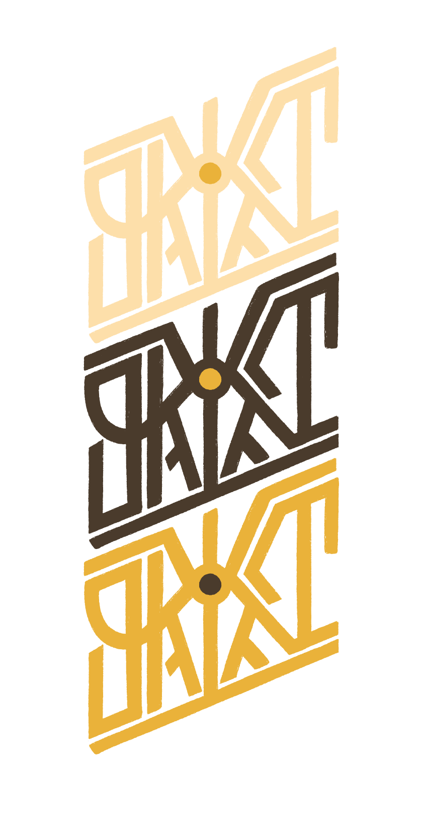
To further expand the logotypes’ style, I created “The Slice.” It brings a sense of motion and action to the identity while providing a vertical layout option.
HALLOWED RUNE
What’s a brand based on runes if it doesn’t have one itself? The handlebar rune is embedded into all the logomarks but also stands on its own.
EXPANDING THE BRAND
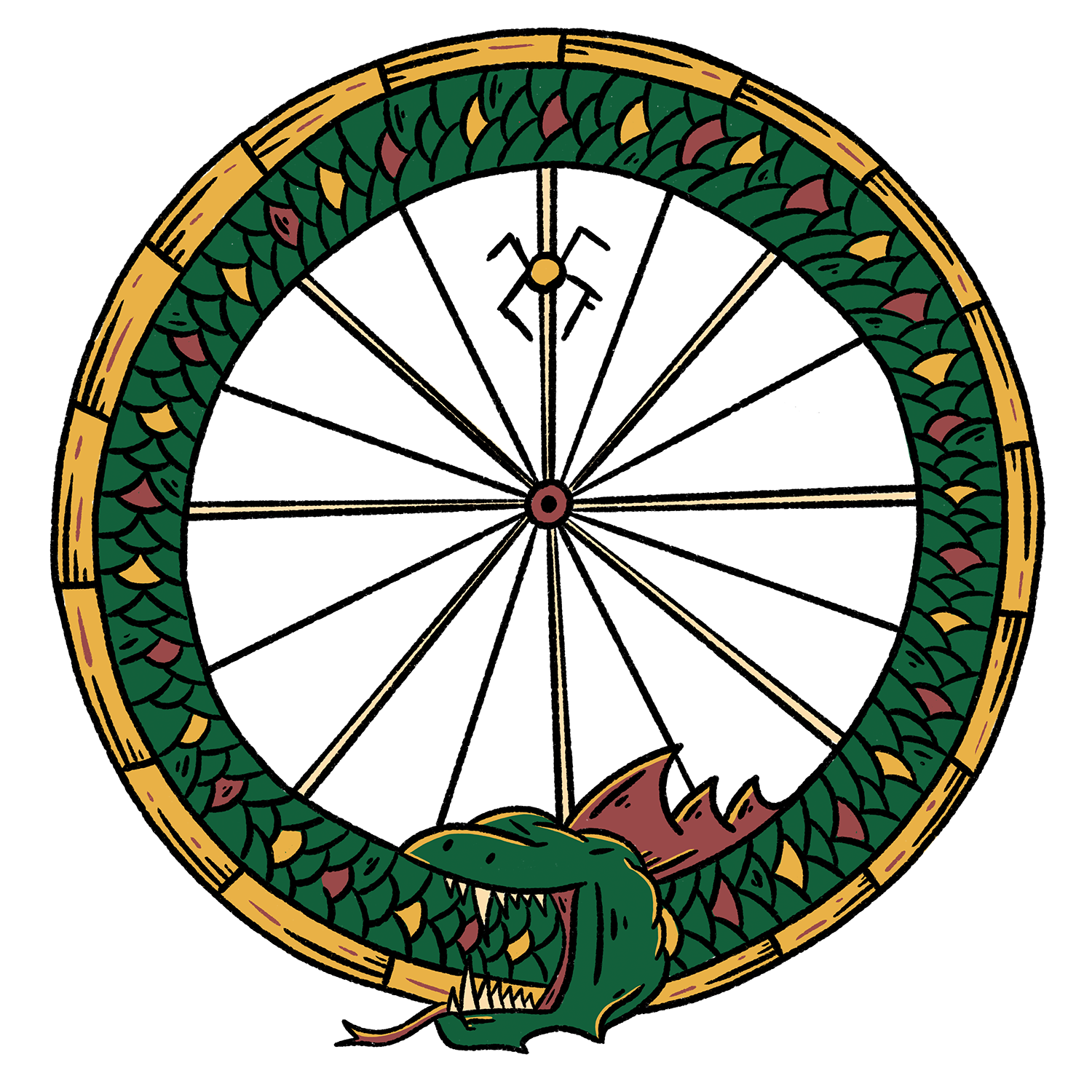
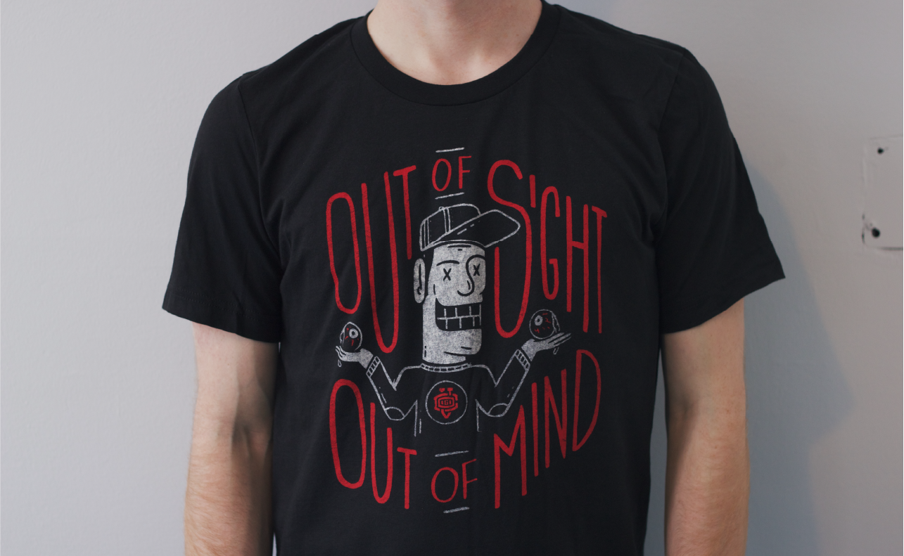
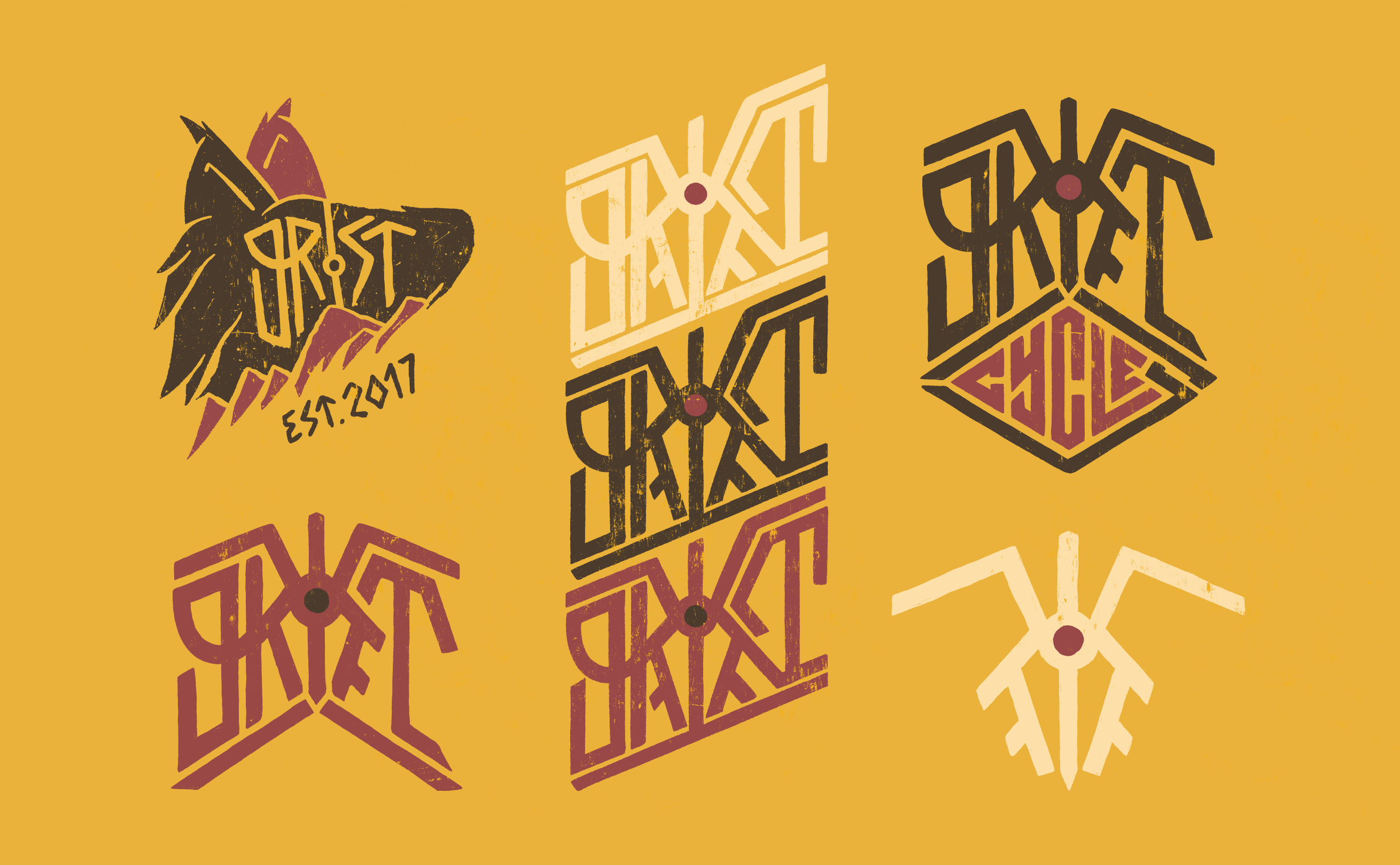
Illustrations & lettering pieces to further the brand narrative in a really fun way.
