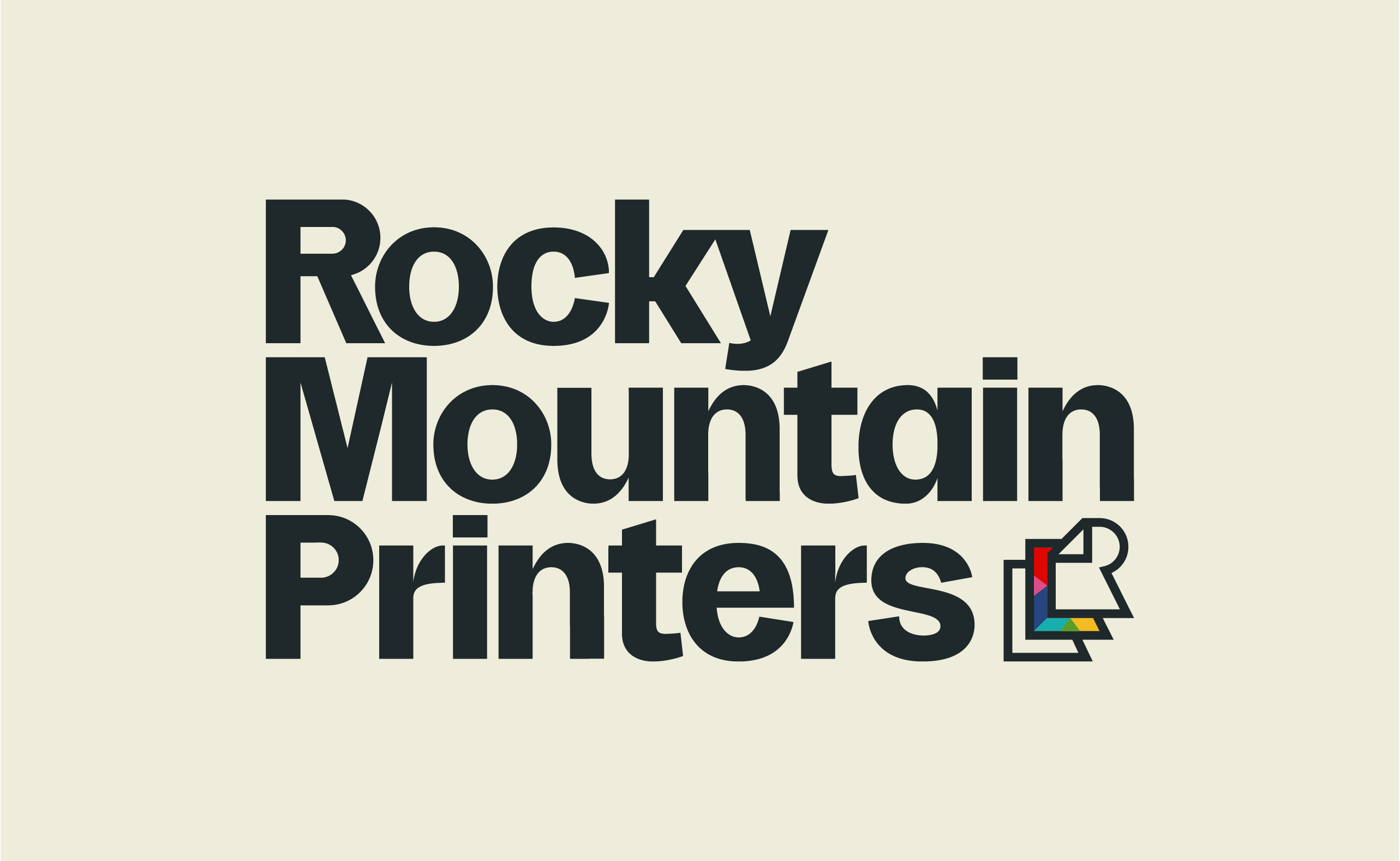
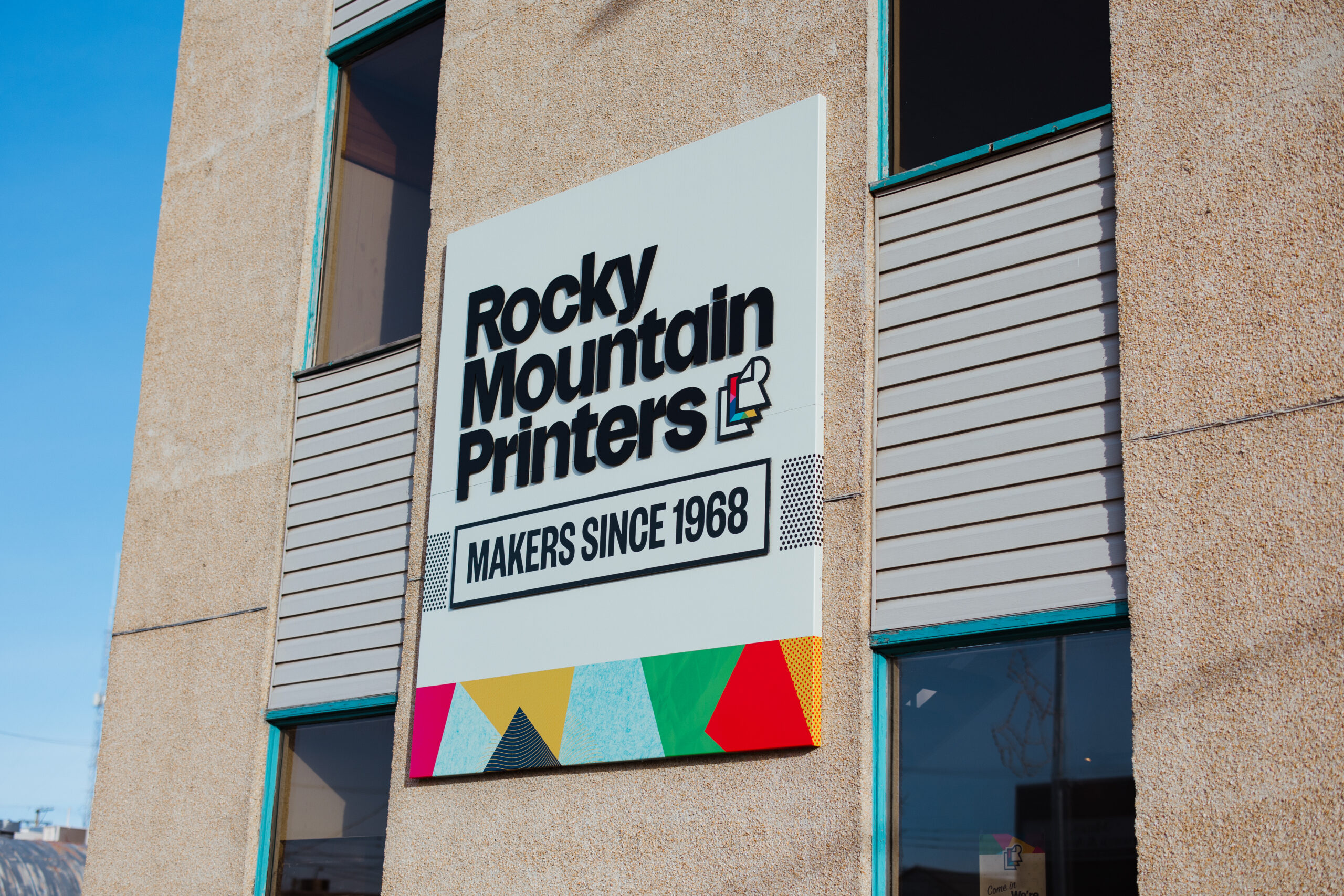
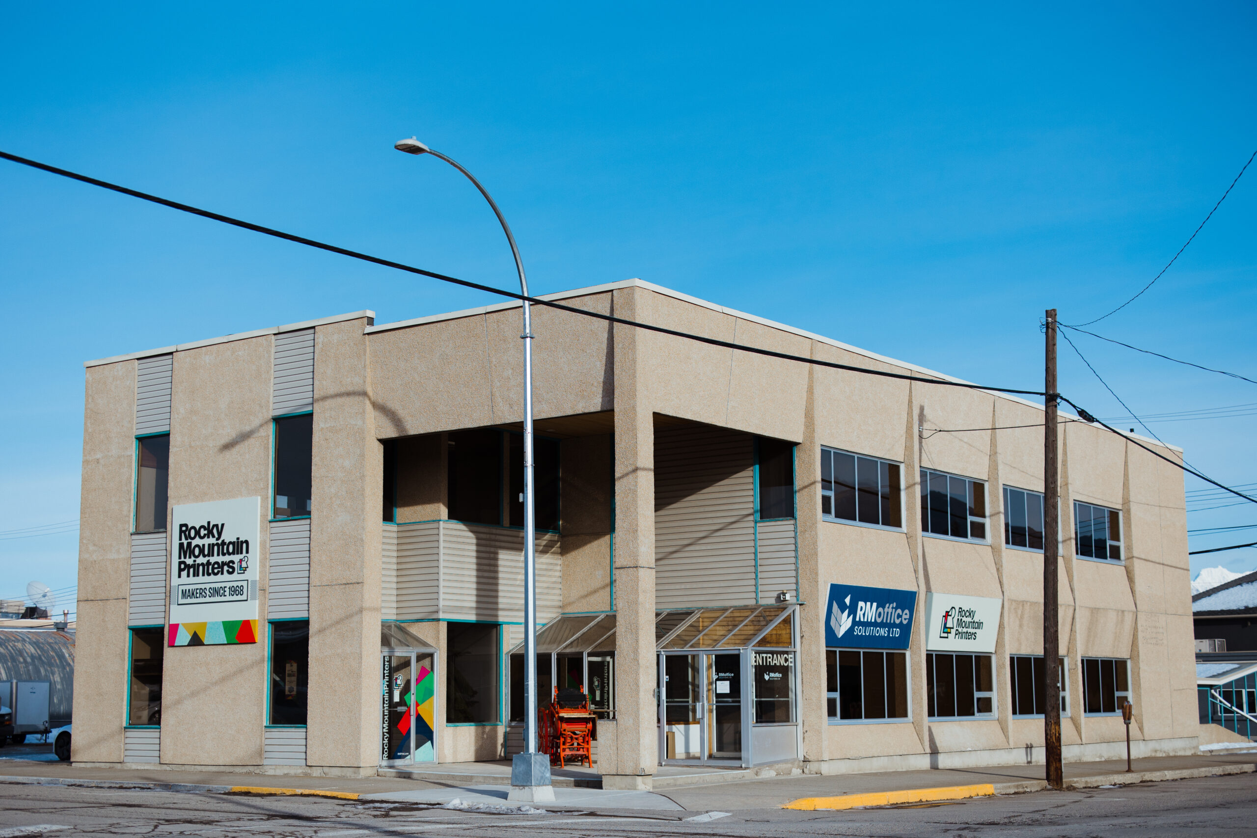
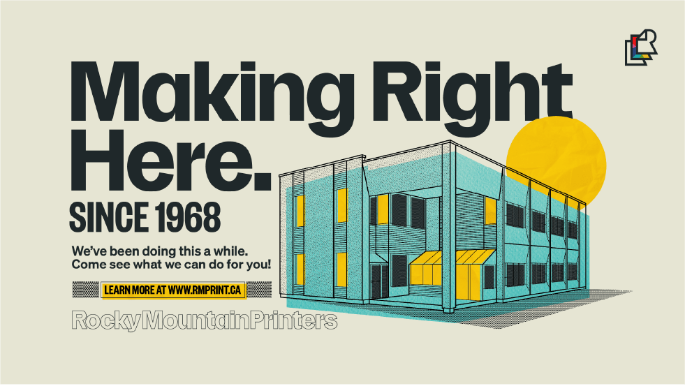
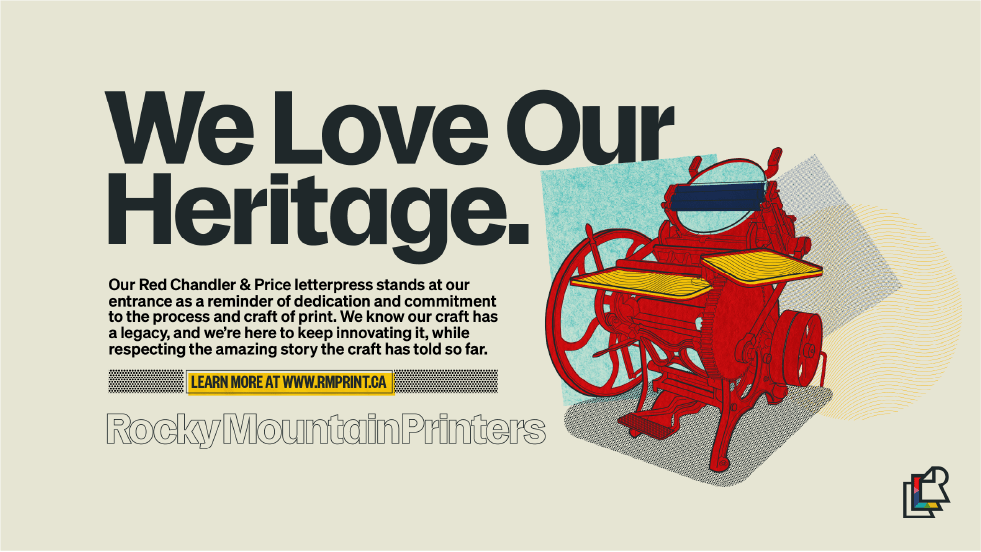
Rocky Mountain Printers has a heritage and legacy that’s hard to come by these days. The Wik family has been running the business out of their shop on 8th Ave in Cranbrook since 1968. Over the years, they’ve become a powerhouse of printing capability, providing the most robust and high-quality products in the entirety of Eastern BC & Western Alberta. RMP came to me looking for a fresh brand identity that would put their craft and quality at the forefront of their visual language while also helping them differentiate from their sister brand RMOffice. My solution is a brand influenced by every decade the company has lived through, emphasizing the touchability and physicality of print.


A TIMELESS ICON
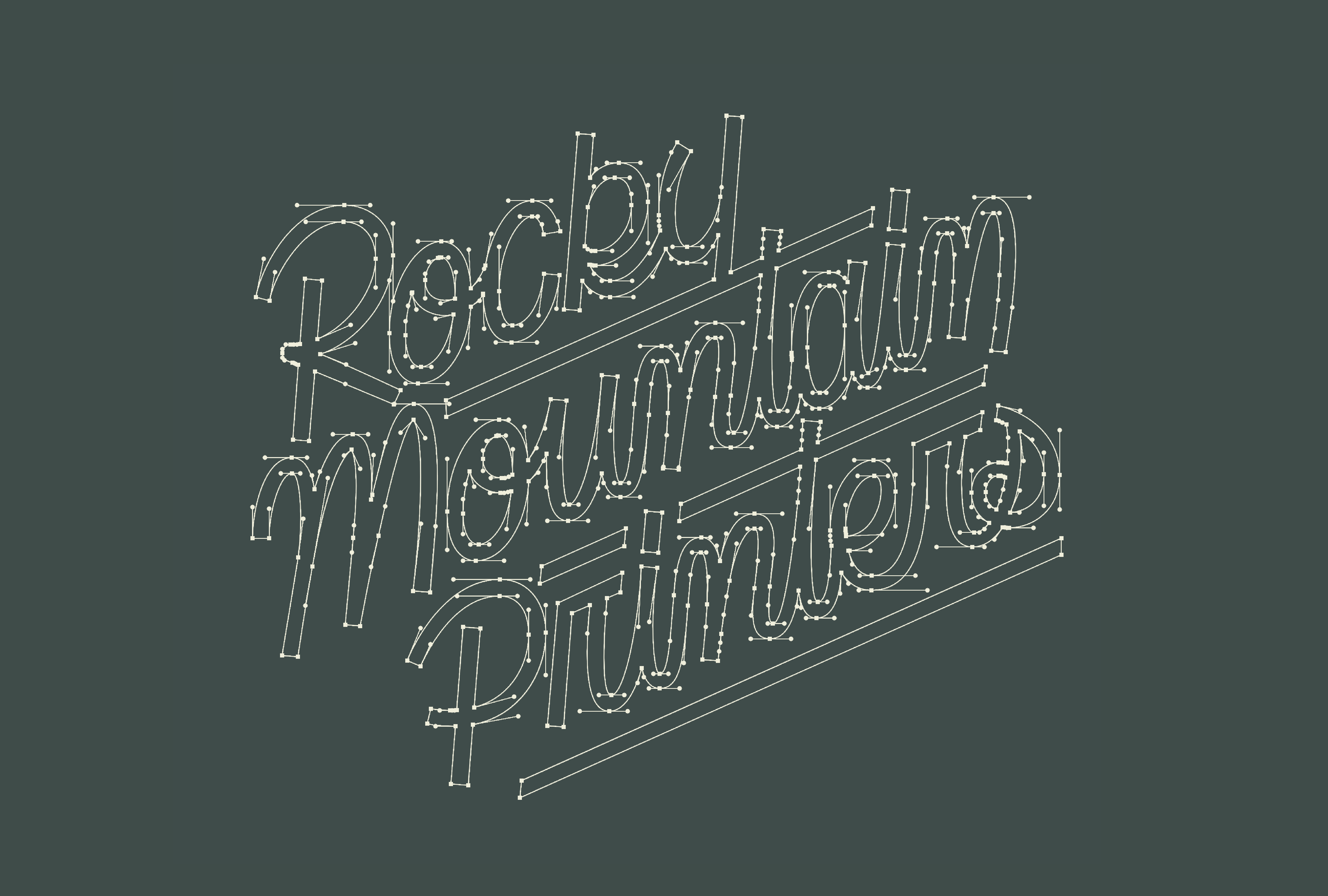
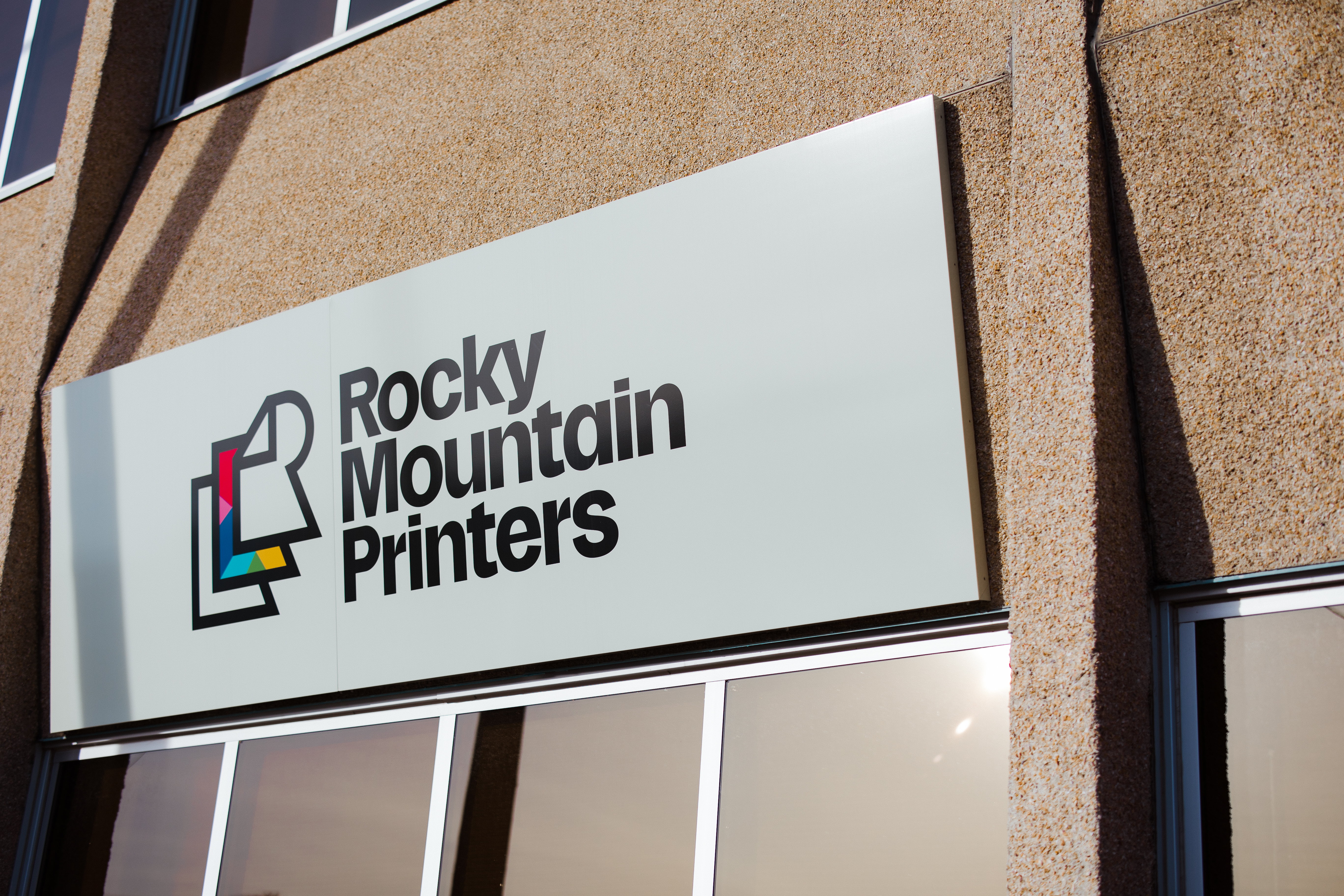
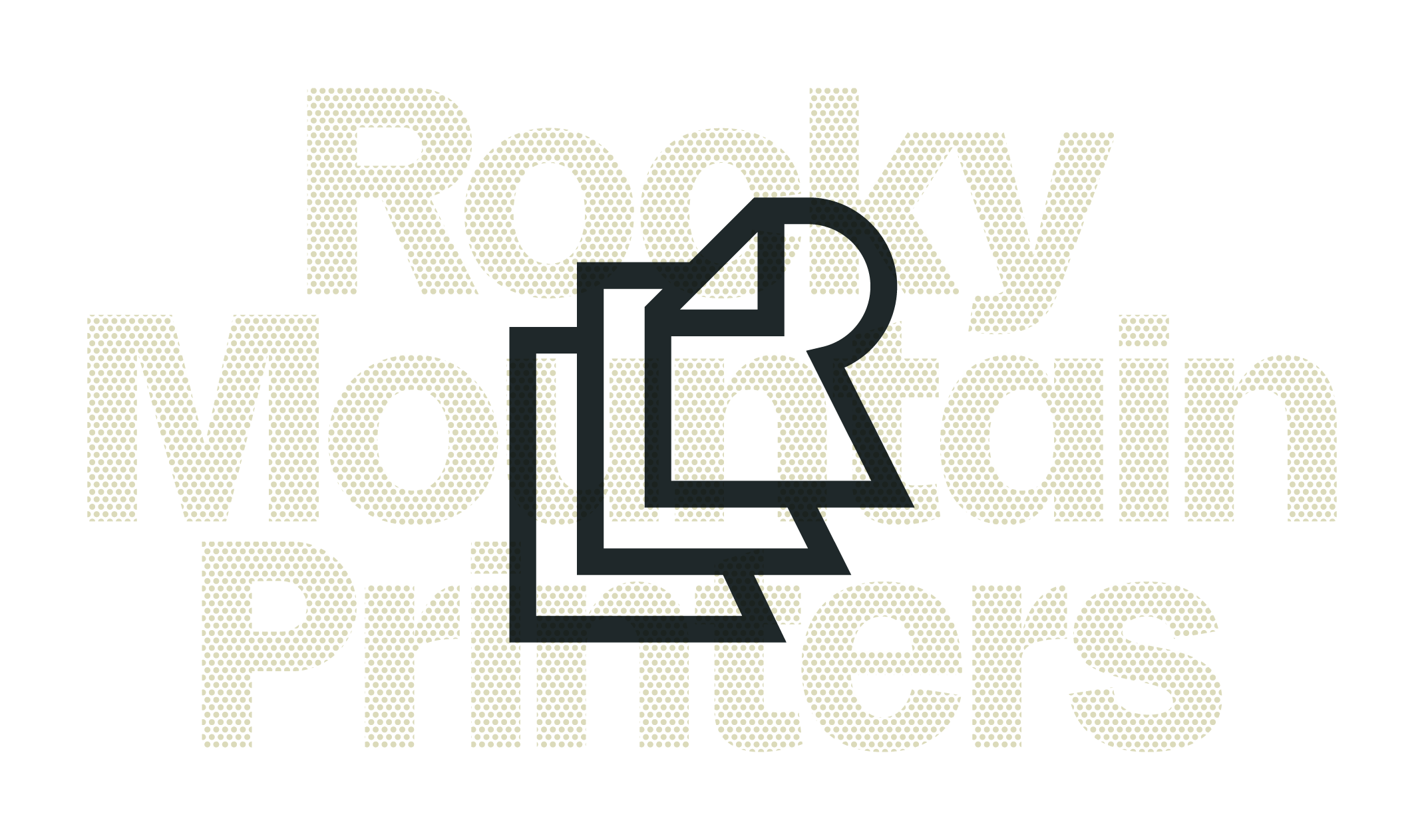
Balancing the utility and craft of printing was at the heart of every decision we made while crafting this brand. From the timeless utilitarian style of the main wordmarks, the bounce and personality of the script mark, and finally, the classic feeling icon, it’s all designed to feel distinctly “print” without being dated or locked into a specific period of time.
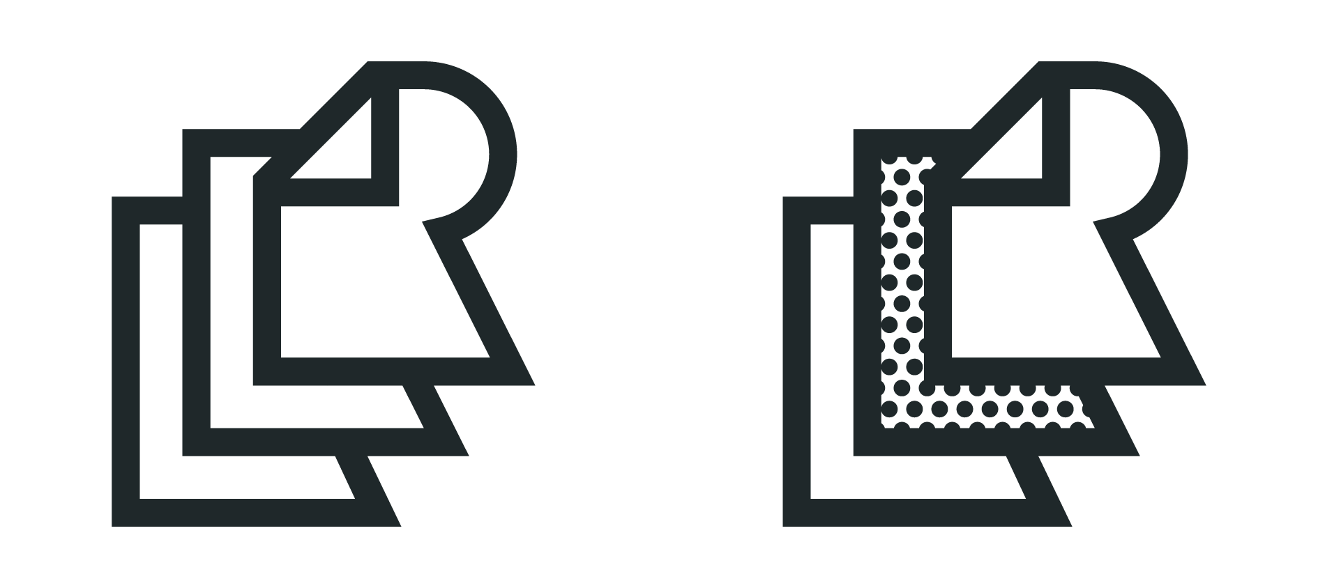
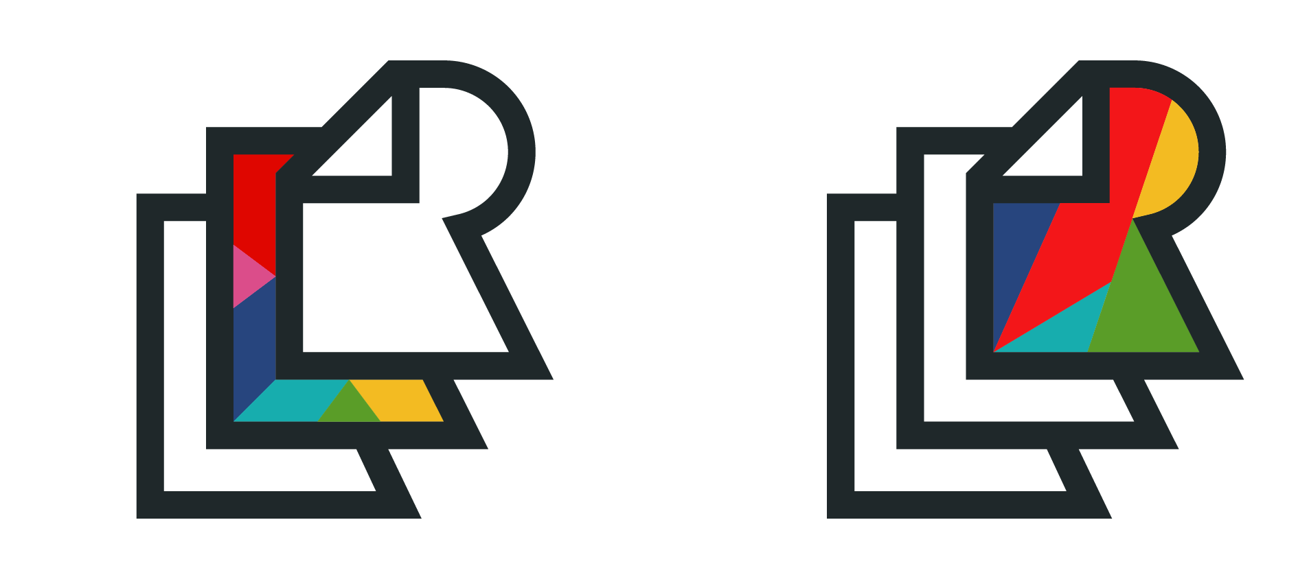
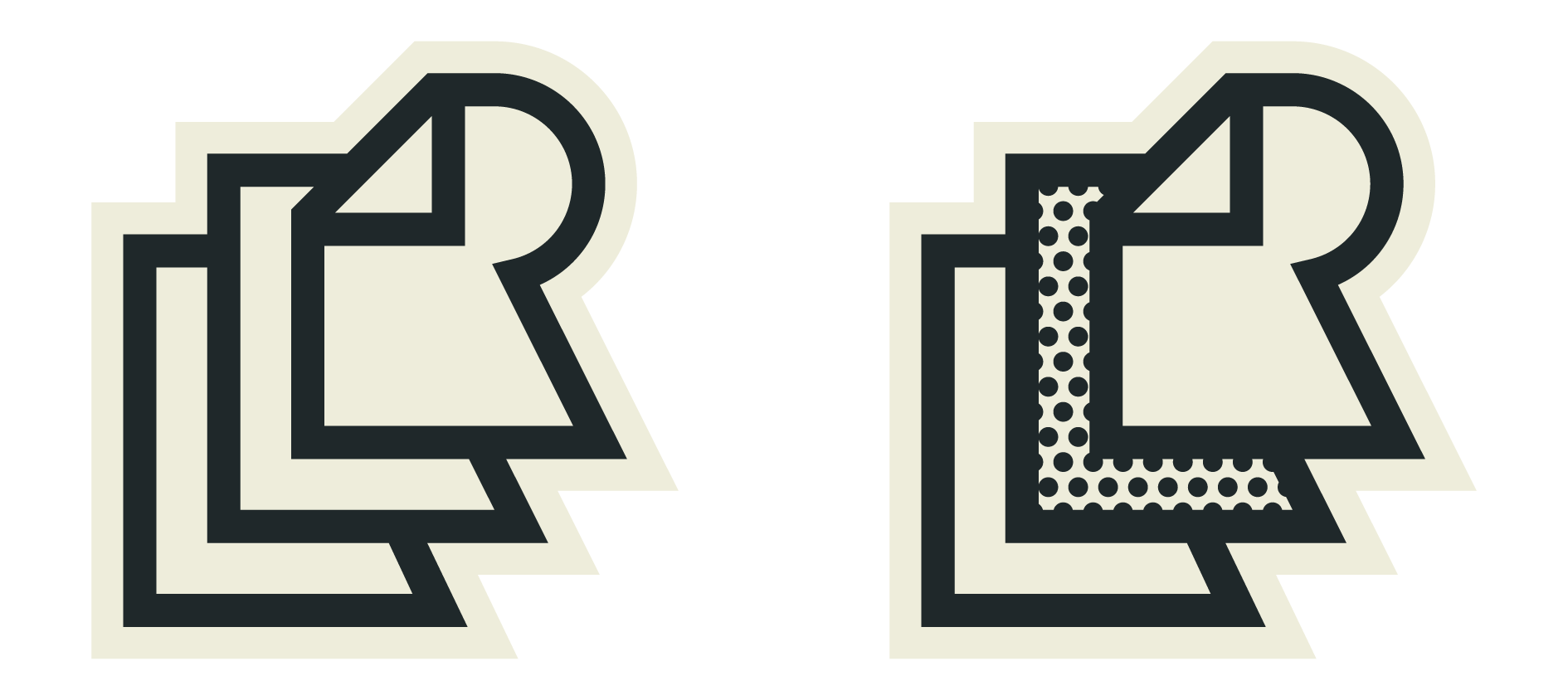
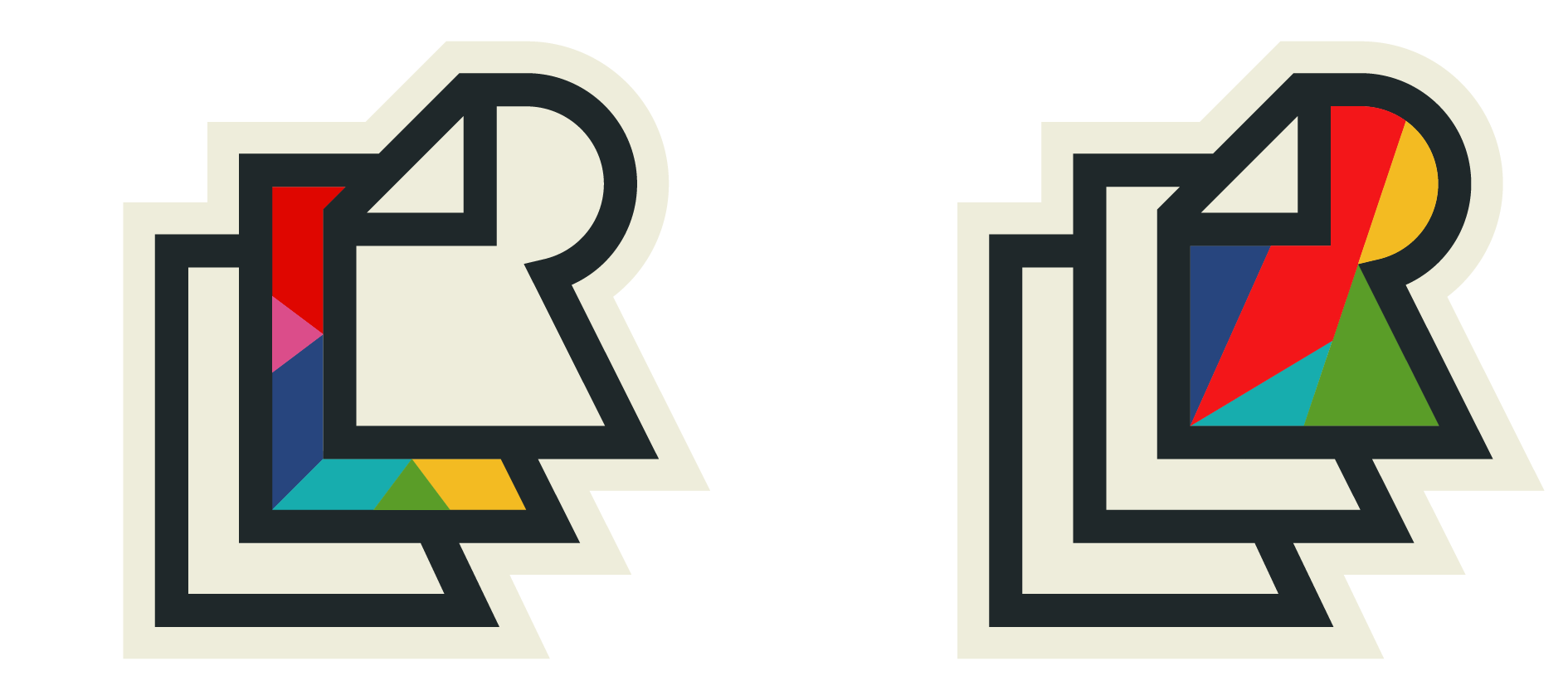
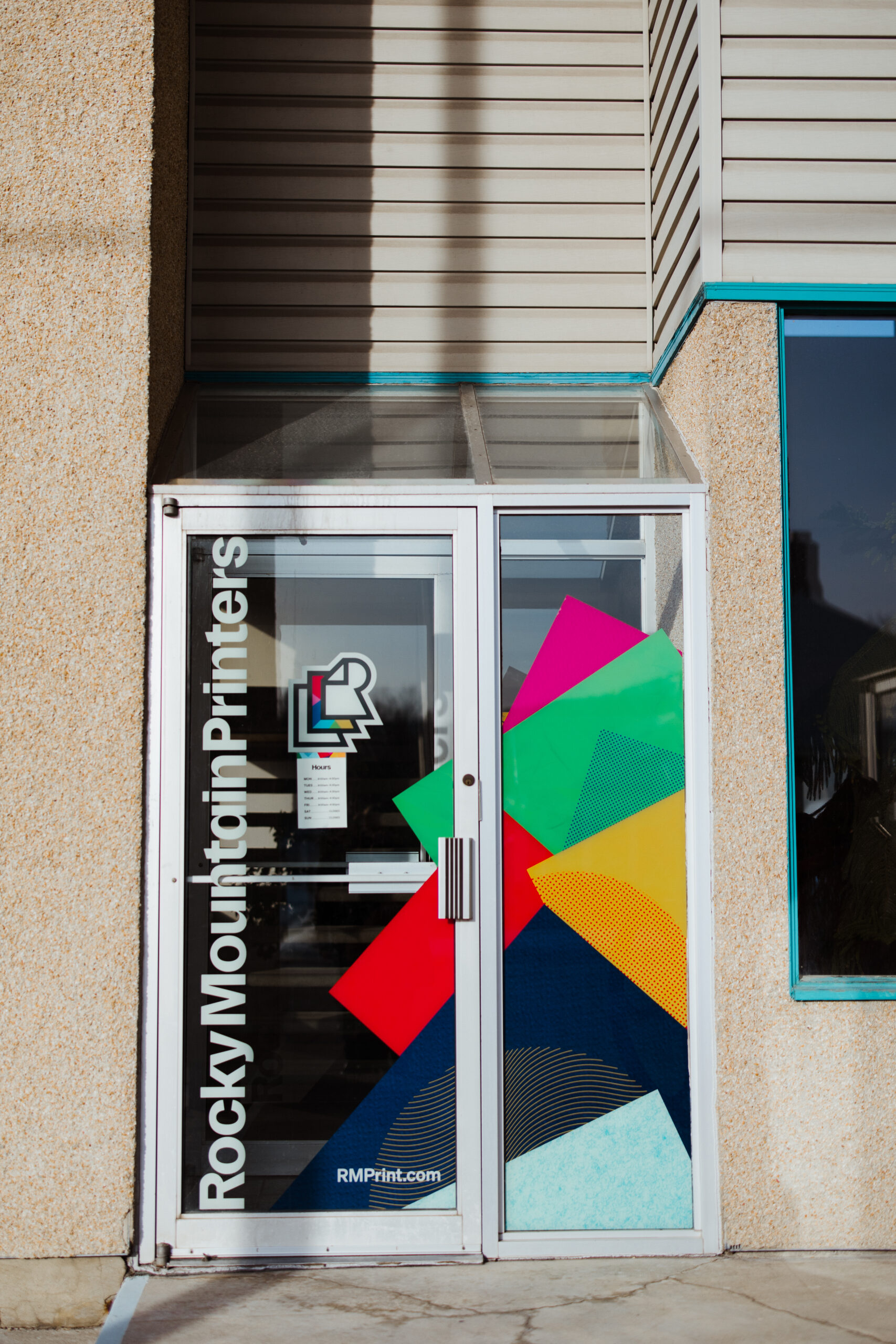
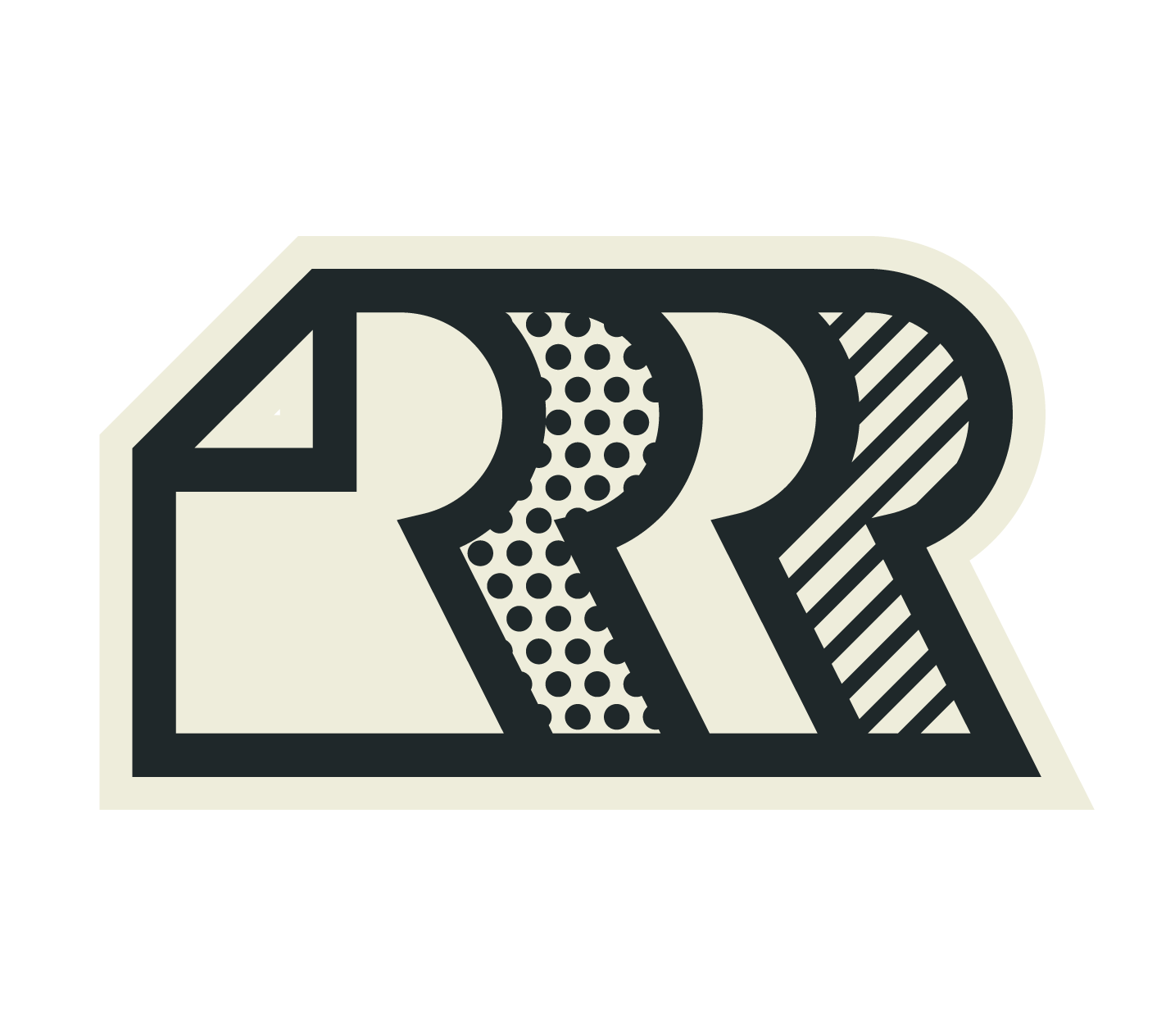
To showcase RMP’s wide range of services, I built the icon to accommodate 4 different styles for specific use cases. Placements that require a more simple and functional approach can use the black and white versions, while the more creative-leaning projects can provide a pop of color and personality with the filled versions.

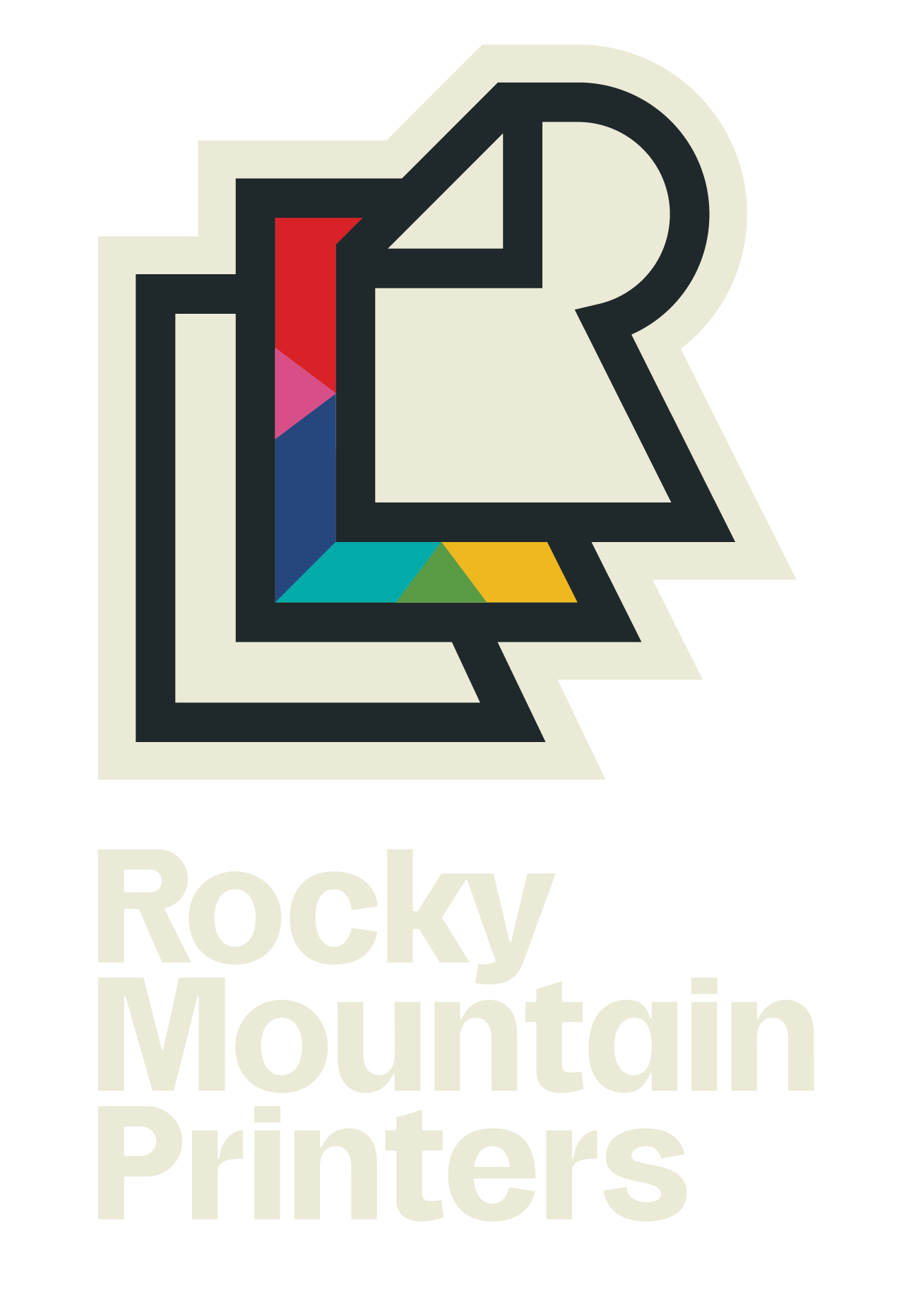
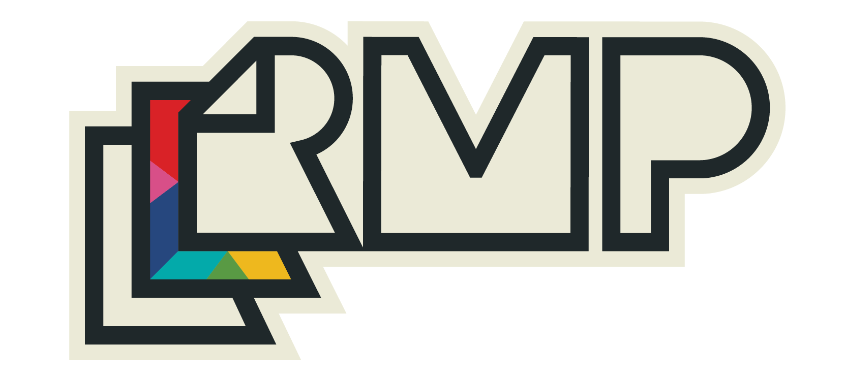
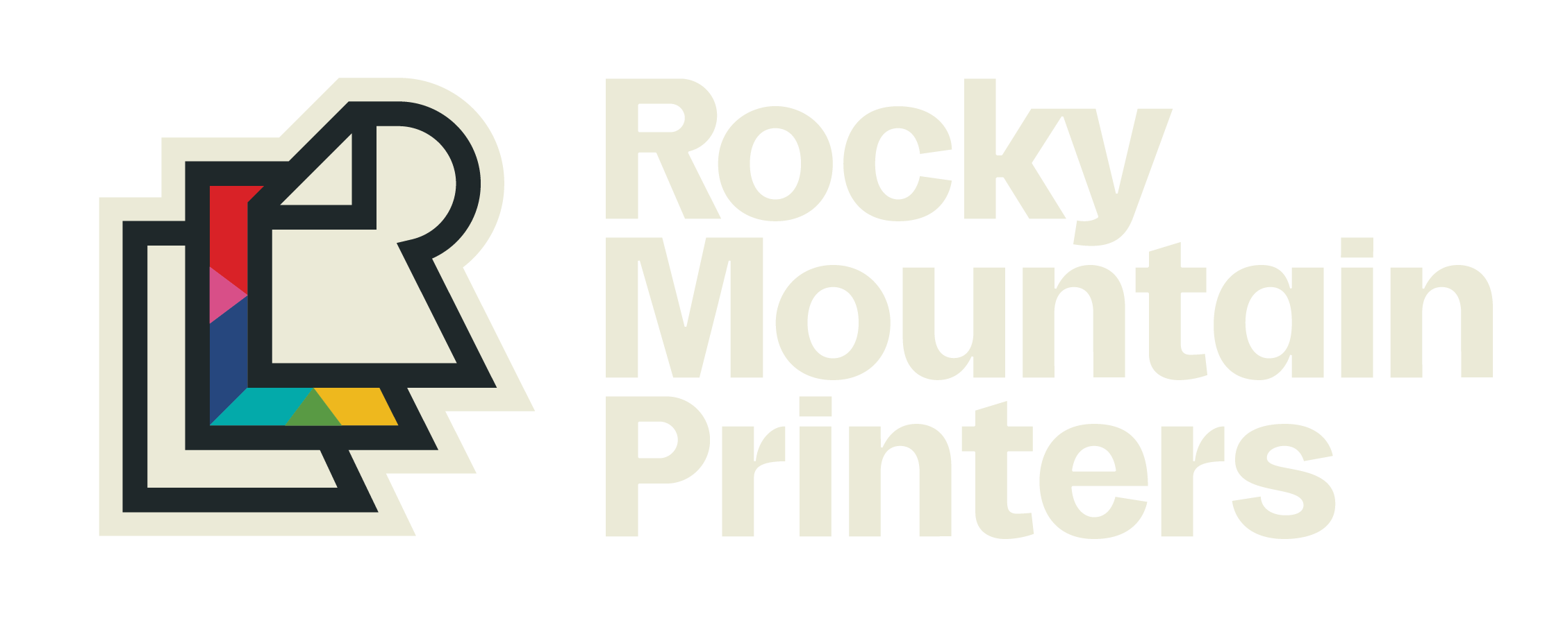
FRESH YET FAMILIAR
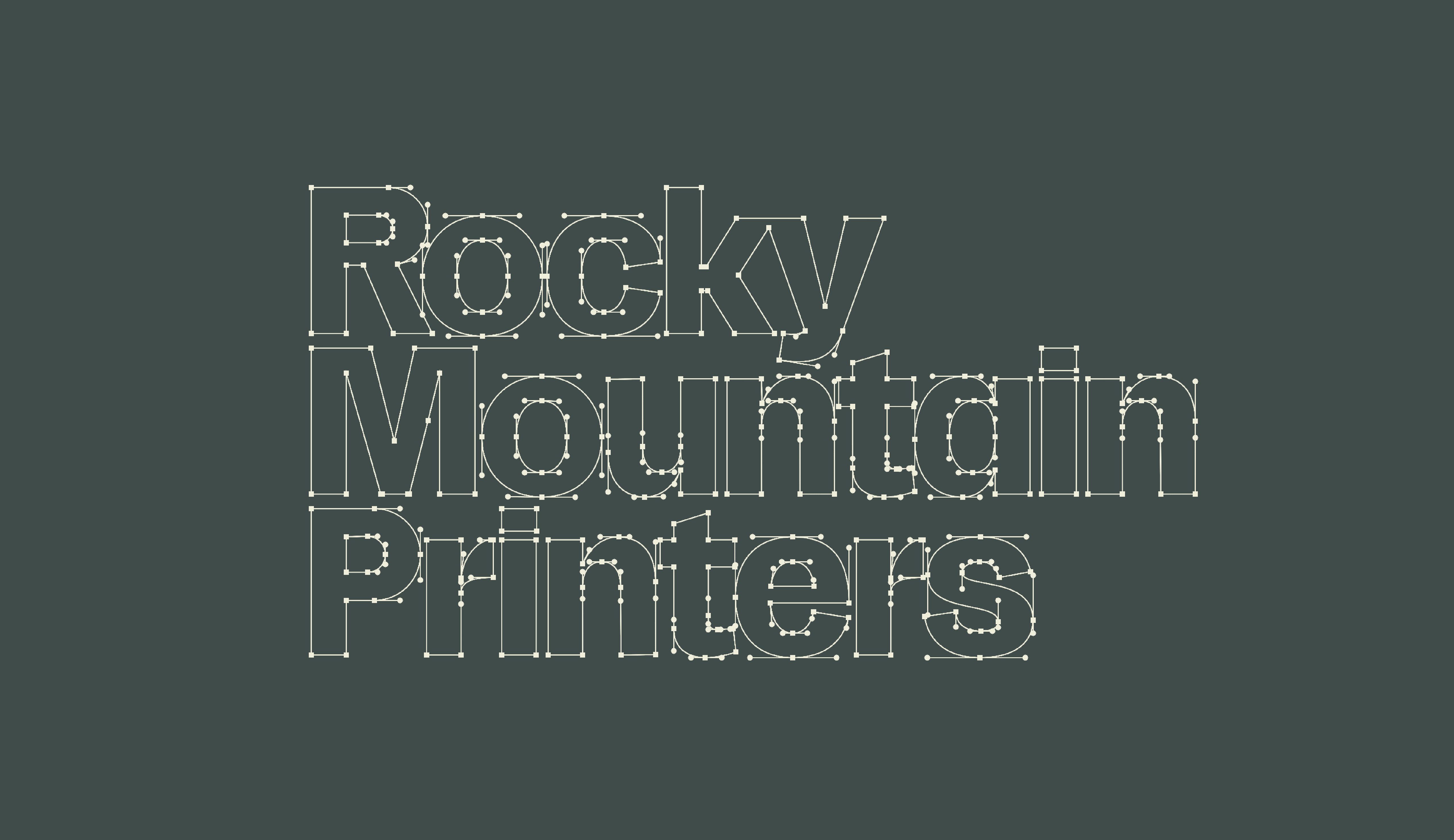
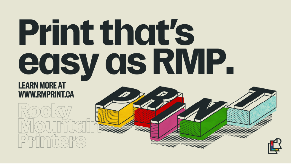
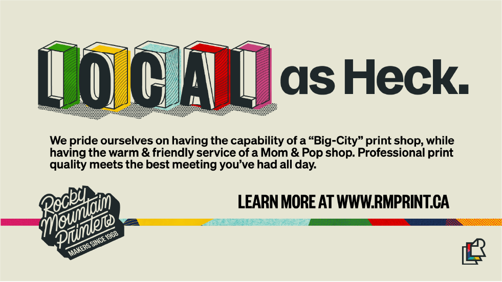
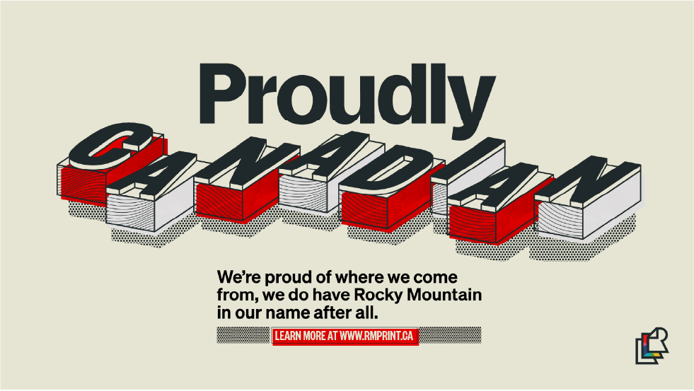
With RMP having such a rich business history, I wanted the typography to feel like it had a story without being too old-fashioned and reaching too far into the “modern/trendy” pool. The final type style combines the character and unique quirkiness of wood type from the early days of printing with a modern “function-forward” styling from the recent days of print history. Combining these two styles creates something timeless and unique that gives RMP a distinct and memorable style with their typography alone.
To help implement this style seamlessly across the branding, I created a full Display Typeface for headings and bold statements. In RMP’s early days, a large bell hung in their entryway, giving way to the building being nicknamed the “Bell Building.” To pay tribute to this fun story and a past German business partner that passed it along, I named the typeface after the German word for “Bell” – “Glocke.” “Glocke Grotesque” brings the style of the RMP wordmarks to every typesetting placement while subtly paying homage to the buildings’ storied history.
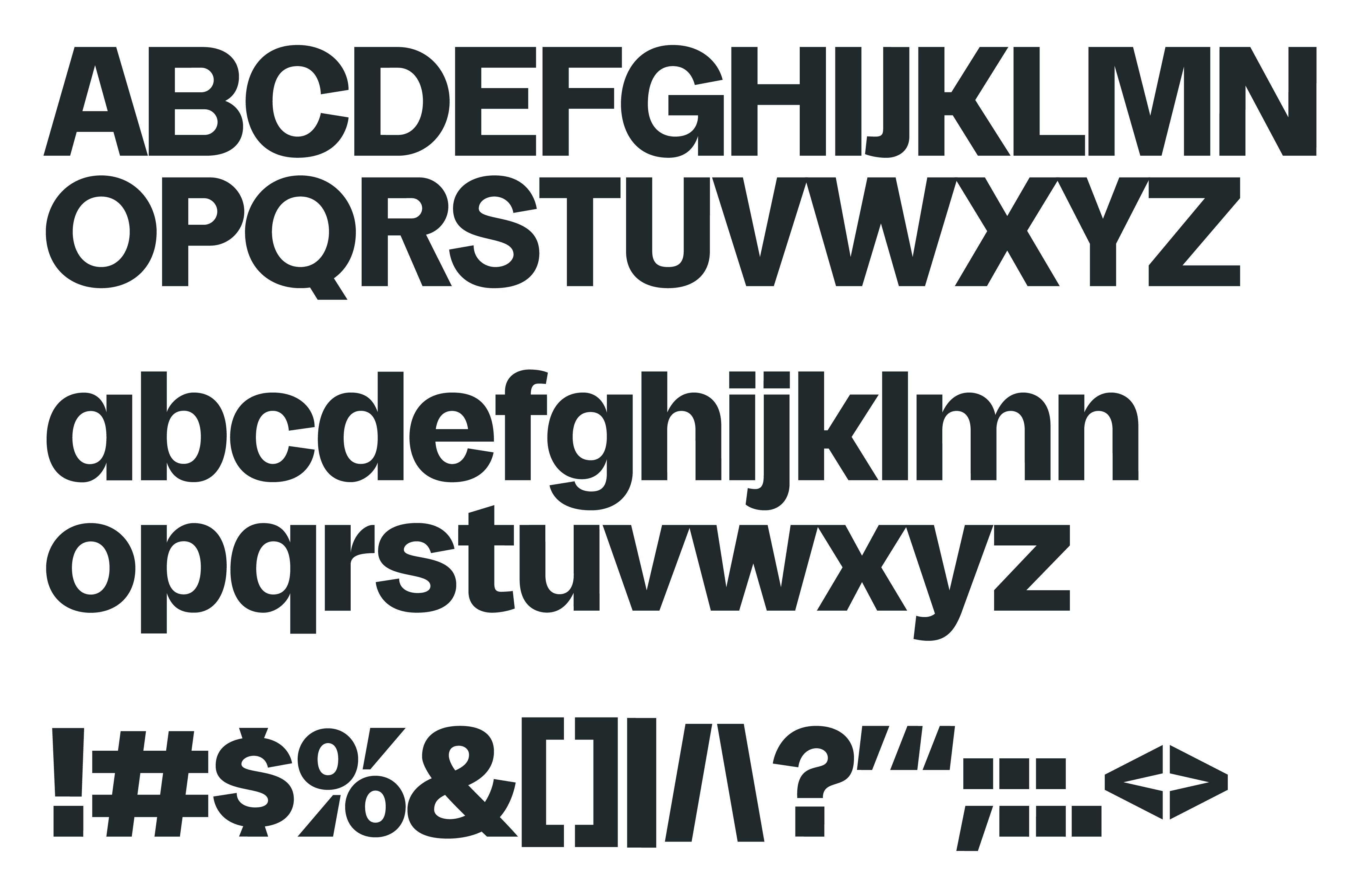
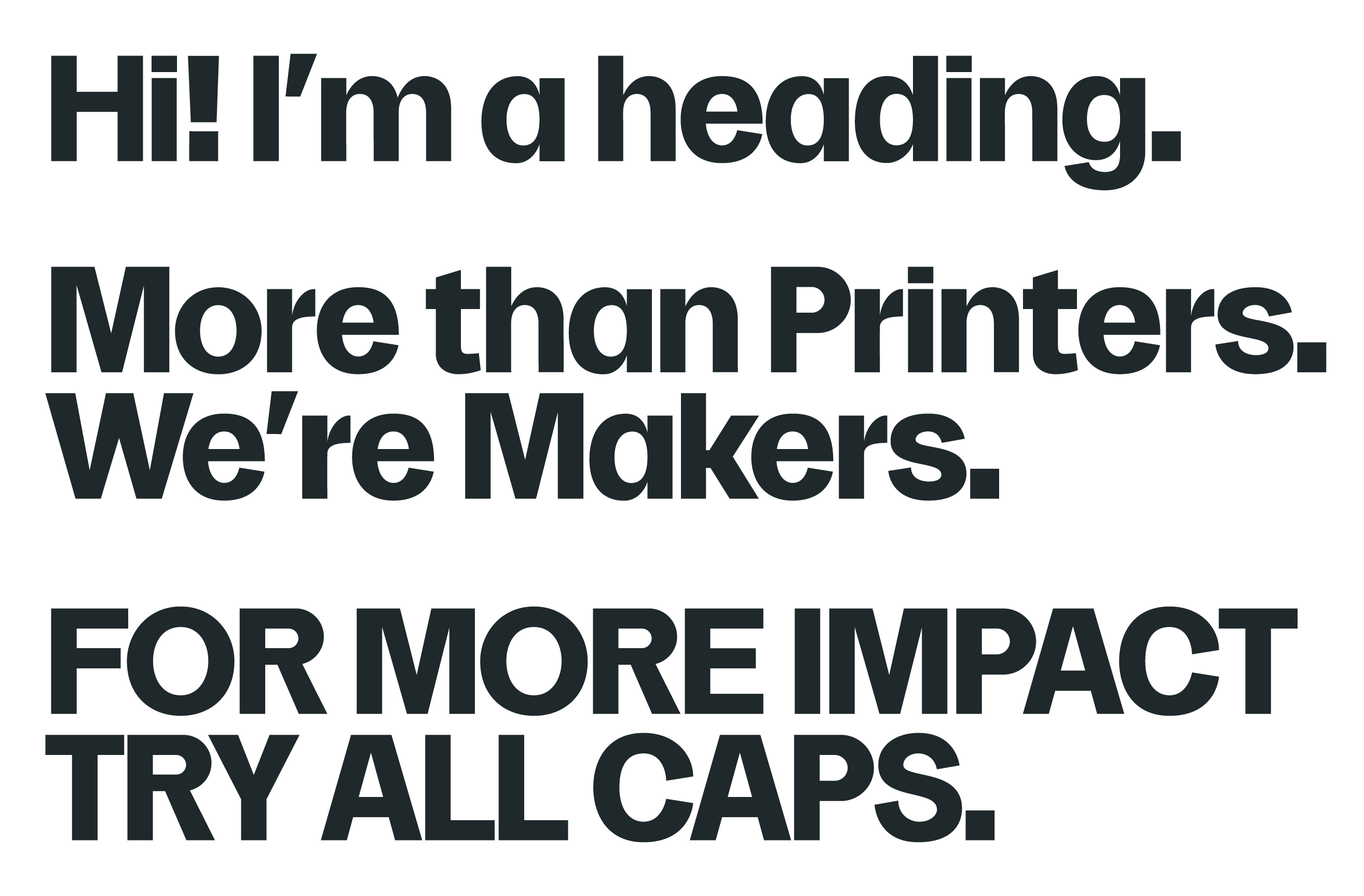
The uppercase of the brand’s custom typeface is designed to subtly reference wood-type letters from the early days of print. Their high-waisted character provides a unique look that isn’t often found in modern sans serif typefaces of this style.
The lowercase was designed with an extra high x-height to provide great legibility and ensure headings felt warm and fun while still being functional at conveying their info.
Together, the typeface collectively provides a solution that can be bold and loud but also friendly, all while being distinct and recognizable.
PAPER TEXTURE
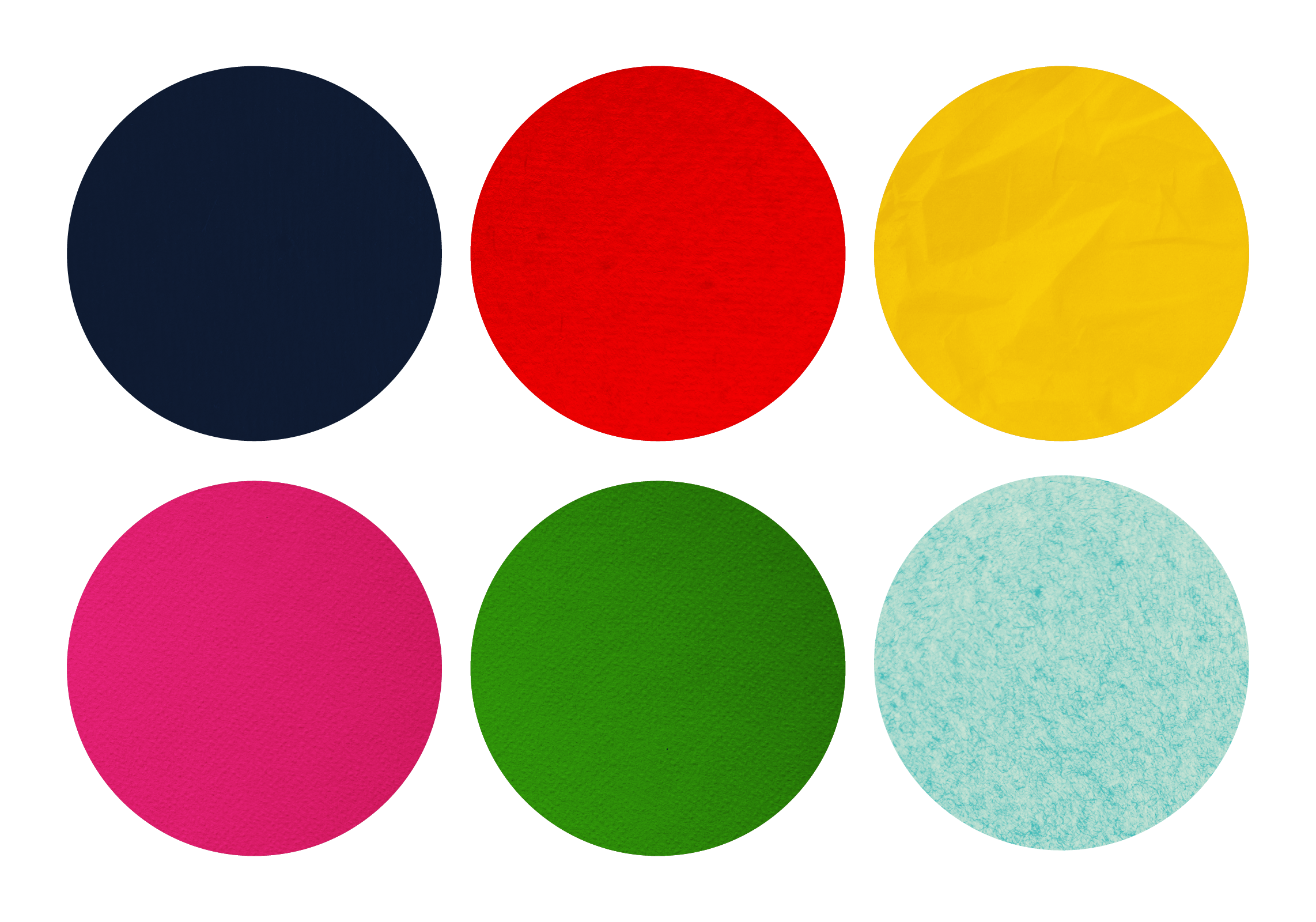
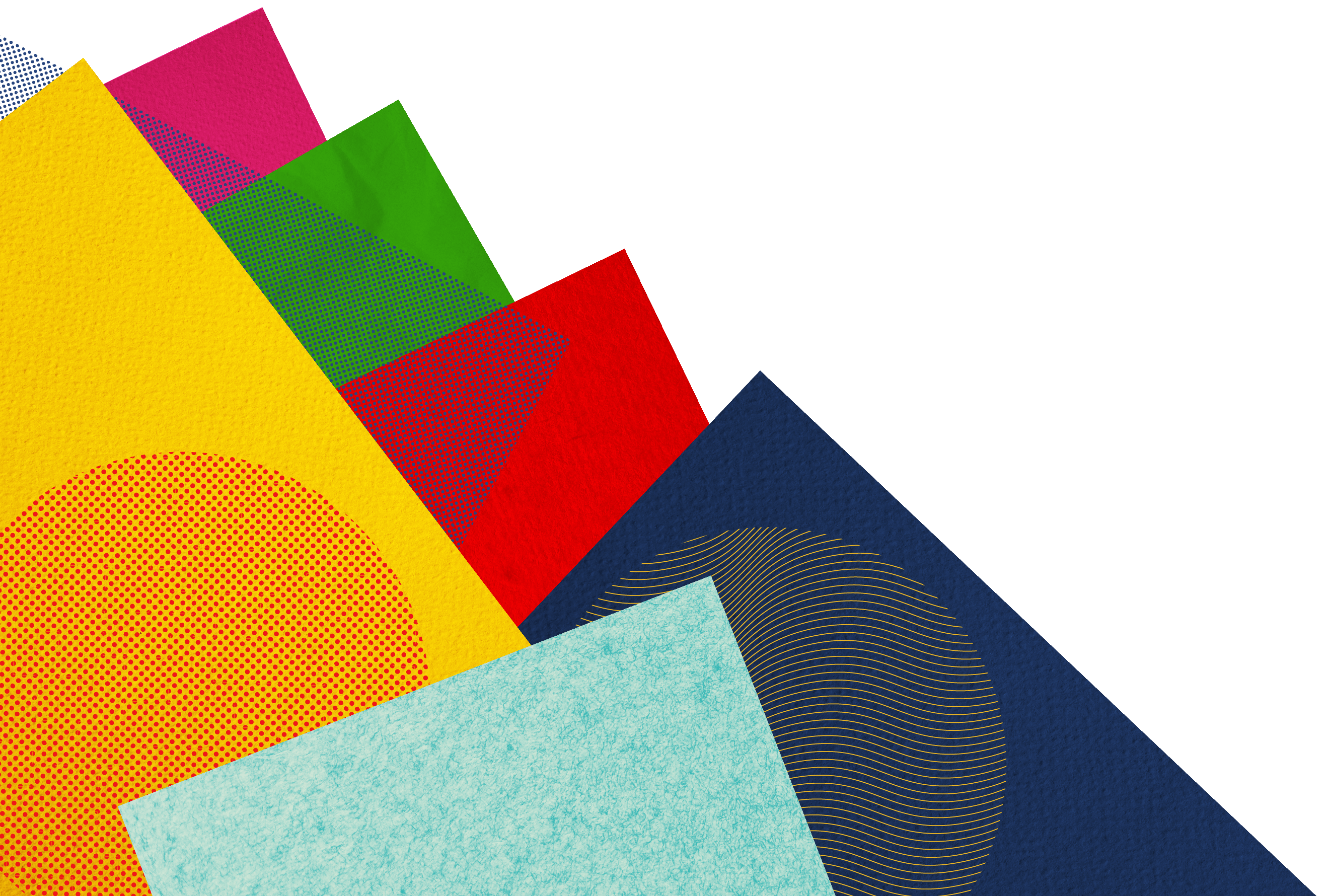
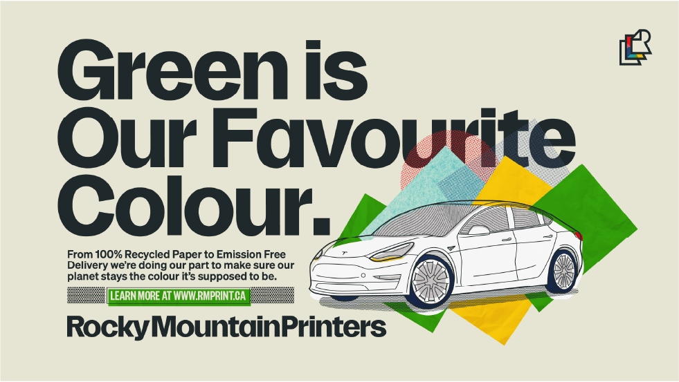
To further emphasize the products and services that RMP can provide, I created a system of implementing color through paper textures that adds a physical print feel to placements that need a pop of personality. This promotes a feeling of touchability and craft while also bringing a bit more life to the brand.
MAKING IT TIMELESS
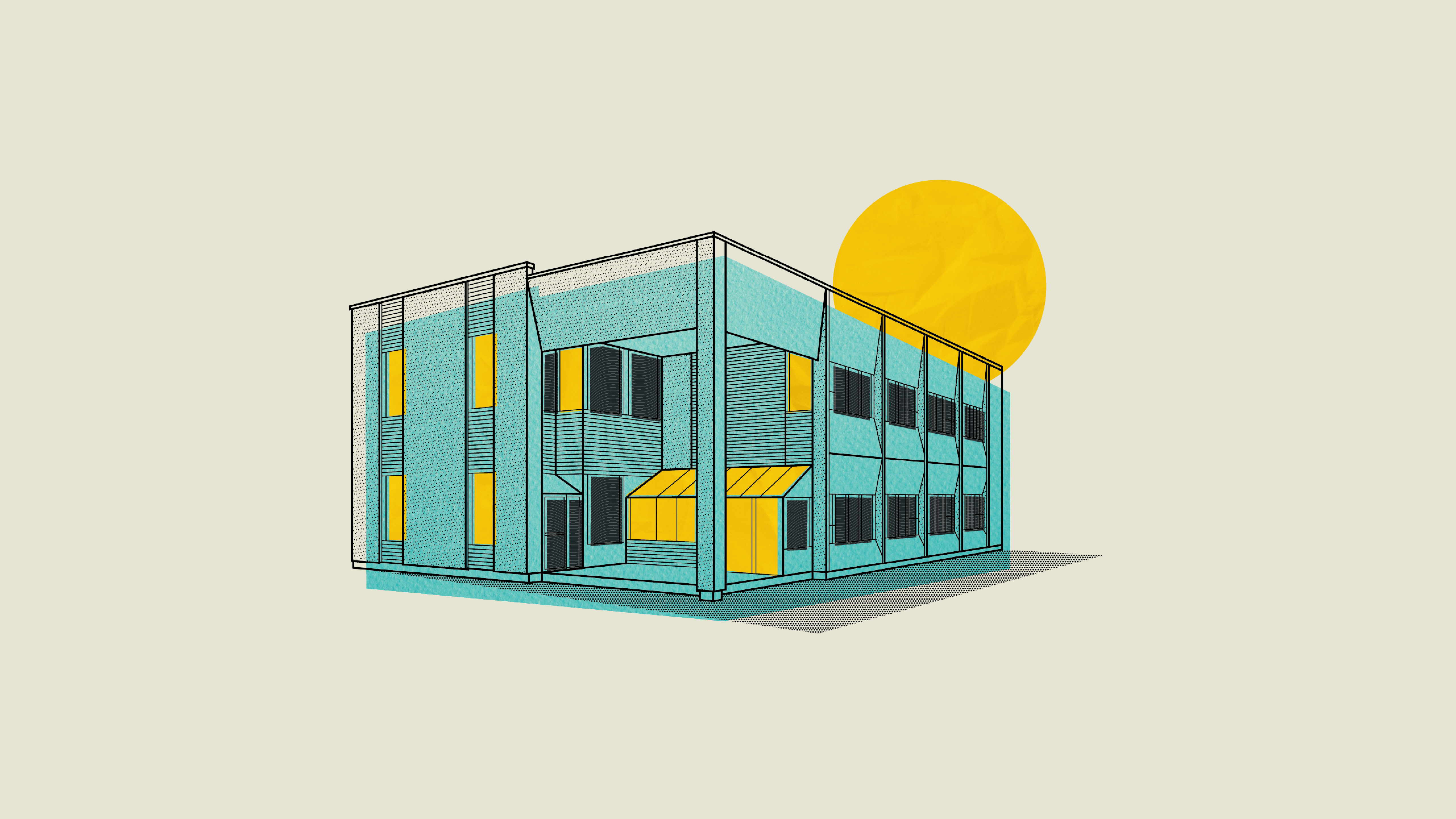
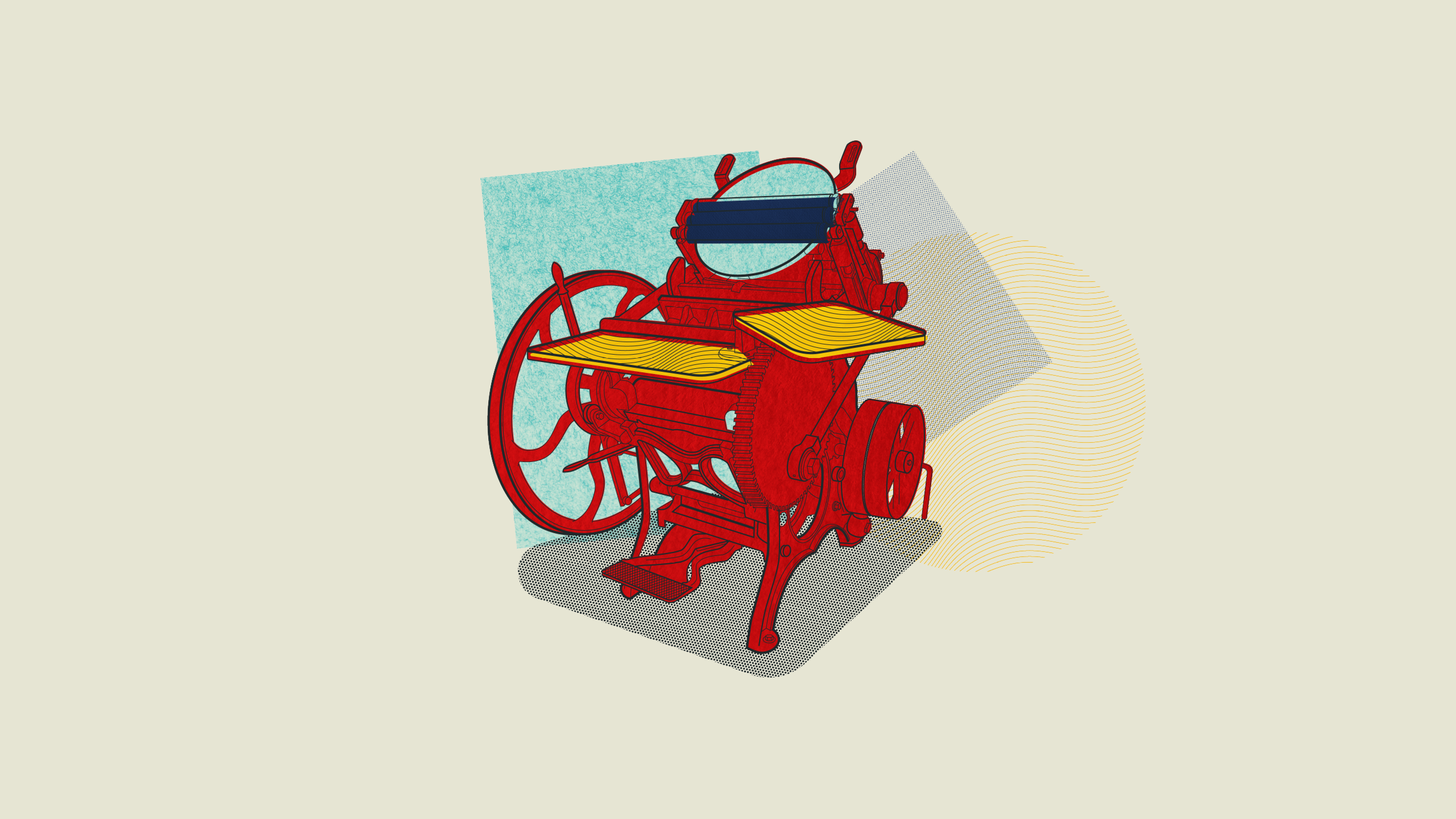
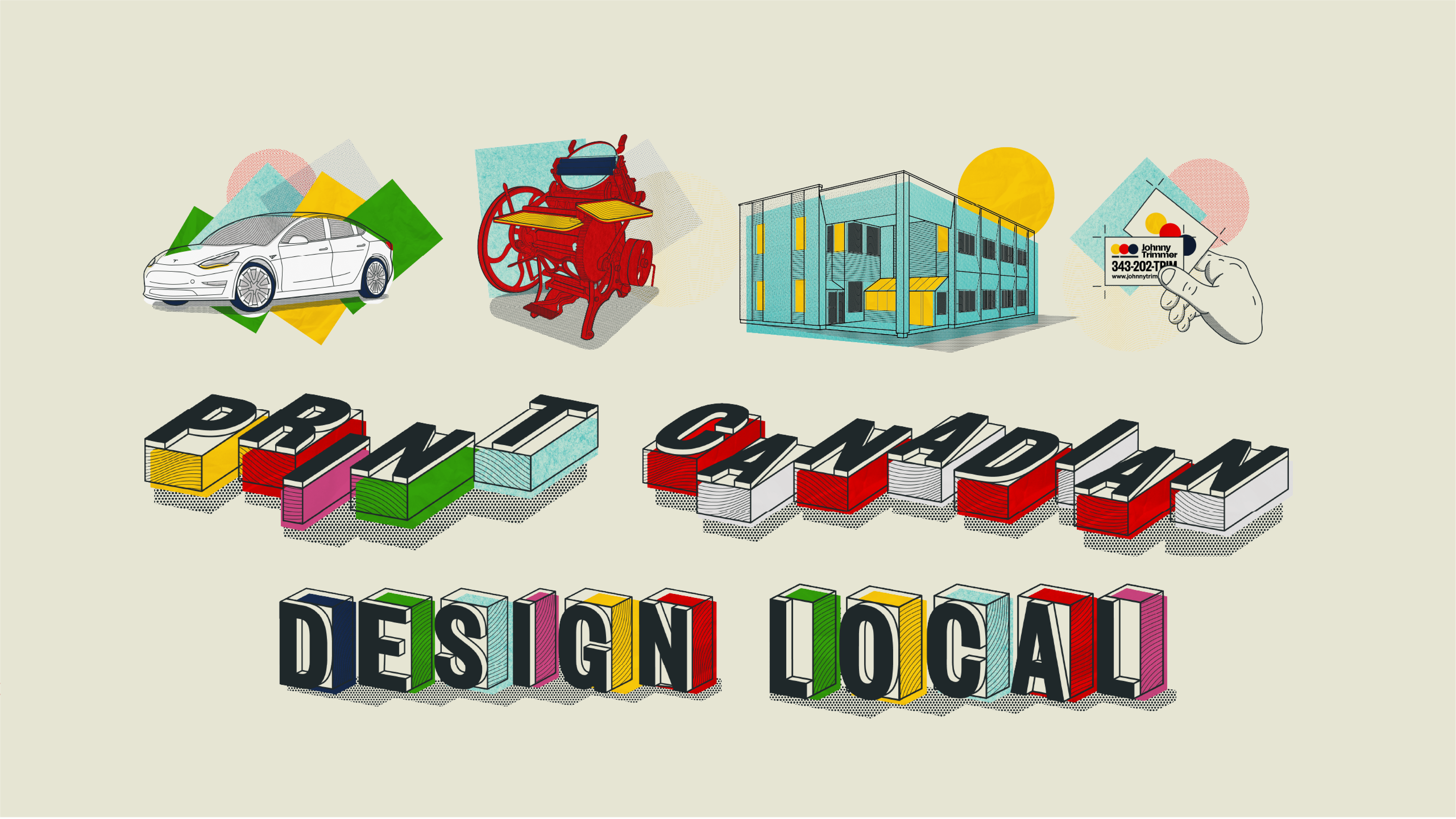
Overuse of texture can make brands feel very dated and unprofessional. To avoid that altogether, I created an implementation style that blends the brand’s colored paper textures with clean vector lines and more traditional print textures like halftones and roller lines. This eliminated any chance of the textures feeling dated and gives the brand illustrations a depth and character to all of their communication assets.

“I remember the first time I saw one of Zach’s designs – it was so vibrant & refreshing – and that was almost a decade ago. Since then, I witnessed his talent explode onto the local business scene & beyond. He’s positively the most brilliant designer I’ve worked with. Before I met Zach, I wouldn’t believe a one man show could handle a rebrand as big as ours. After the initial meeting, our team unanimously agreed we made the right choice. With each stage of the process, we were blown away by what he captured from our meetings and how that translated into our brand… he listened to every team member, took every dream & fear we expressed and turned it into an incredibly thoughtful & versatile branding system. It was so obvious that he was the type of person who digs deep. I’ll never forget the big smiles from our team when I presented what Zach created. I feel honoured that I had the chance to witness his process and I won’t hesitate to recommend his skills to any one who understands the impact of good design (we’ve been printing long enough to know – bad design costs a fortune).”
JESSICA BRITTON – GENERAL MANAGER
“I remember the first time I saw one of Zach’s designs – it was so vibrant & refreshing – and that was almost a decade ago. Since then, I witnessed his talent explode onto the local business scene & beyond. He’s positively the most brilliant designer I’ve worked with. Before I met Zach, I wouldn’t believe a one man show could handle a rebrand as big as ours. After the initial meeting, our team unanimously agreed we made the right choice. With each stage of the process, we were blown away by what he captured from our meetings and how that translated into our brand… he listened to every team member, took every dream & fear we expressed and turned it into an incredibly thoughtful & versatile branding system. It was so obvious that he was the type of person who digs deep. I’ll never forget the big smiles from our team when I presented what Zach created. I feel honoured that I had the chance to witness his process and I won’t hesitate to recommend his skills to any one who understands the impact of good design (we’ve been printing long enough to know – bad design costs a fortune).”

